ENEnglish
 LTLietuviškai
 DEDeutsch
 FRFrançais
 RUРусский
 ESEspañol
 PLPolski
 ITItaliano
 UKУкраїнська
 CSČeština
 PTPortuguês
 JA日本語
 LVLatviešu valoda
 ETEesti
 HUMagyar
 IDBahasa Indonesia
 TRTürkçe
 HIहिन्दी
 ELΕλληνικά
 ARالعربية
 THไทย
 VITiếng Việt
 RORomână
 MSBahasa Melayu
 BNবাংলা
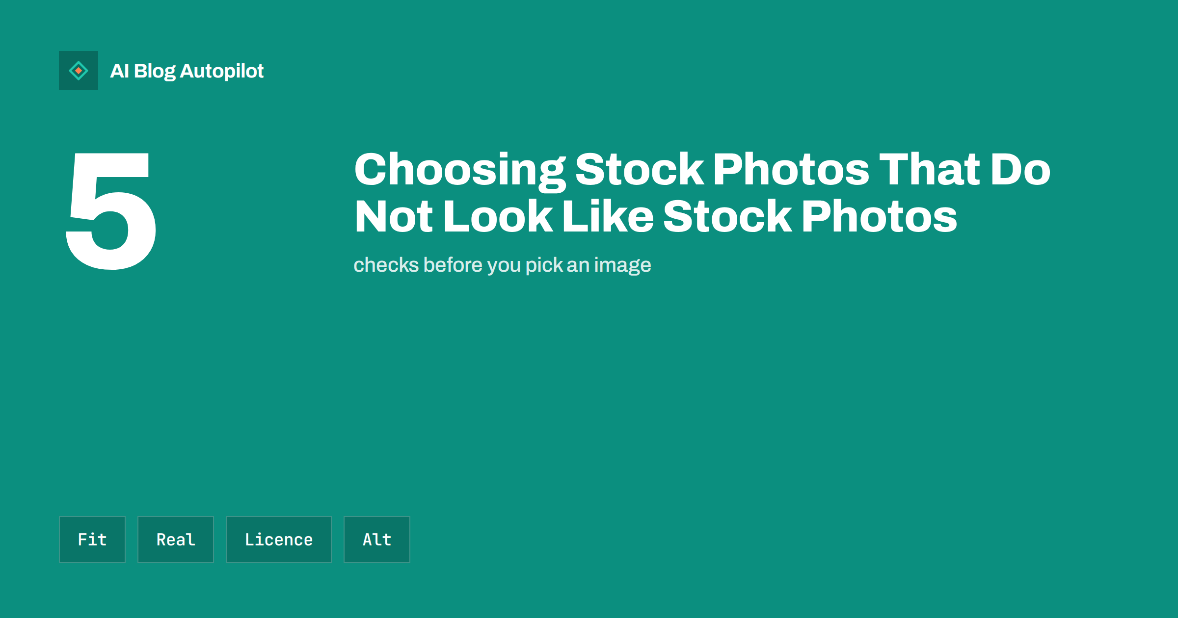
Short answer: choose stock photos that show the exact point of the article, look like real places and people, and match the rest of your visuals. Avoid the usual cliches, crop and edit lightly for consistency, check the licence for your use, write useful alt text and replace stock with your own photos wherever you can.
Readers notice generic images faster than most writers expect. A smiling group around a laptop or a handshake over a desk tells them nothing and often signals that the page was made in a hurry. The trouble is that many small businesses cannot photograph everything themselves, so stock images remain useful when chosen with care.
This guide explains how to choose, adapt and describe stock photos so that they support your article instead of decorating it. It also covers licences, consistency, performance and a simple routine for a team that publishes often.
Start with what the image must do
Before you search, write one sentence about the job of the picture. Is it meant to explain a step, set a mood, show a place or simply break up a long page? An image that explains is worth more than one that decorates, and the answer shapes what you look for.
If the article describes a process, look for photos of the actual tools, materials or setting involved. If it covers a feeling, such as relief at solving a problem, look for natural expressions rather than posed ones. If it is a list, consider whether a small diagram or a table would serve the reader better than a picture.
Not every section needs an image. A page crowded with weak pictures is slower to load and harder to read. A few well-chosen images, placed where they help, work better than one under every heading. The guide to screenshots, diagrams and charts shows when another format wins.
Spot and avoid the cliches
Some stock images are so overused that readers recognise them at a glance: the headset-wearing customer service agent, the businessperson pointing at a glowing chart, the perfect team laughing at a salad. They say “stock” before the reader sees the headline.
Look for signs of artificiality. Perfectly clean desks, unnatural poses, strange hands and a lack of any brand marks or real context all give it away. Prefer images with texture: a worn workbench, a cluttered shelf, a street with ordinary people. Slightly imperfect photos usually feel more trustworthy.
Try searching with specific, unusual terms instead of the obvious one. Search for “bakery flour dust morning” rather than “baking”, or the tool names rather than the trade. Scroll past the first page of results, since those are the images everyone else picks. You can also search by colour or orientation to find options that fit your layout.
Match your own look
A page filled with photos of differing colours, lighting and styles looks patchy. Decide on a few rules: a colour range that suits your brand, a preference for natural light or a certain level of warmth. Apply them when choosing, and keep a short note for anyone else who picks images for you.
Light editing helps. Crop to a consistent ratio, adjust brightness, and apply the same slight colour treatment across a set of images. Do not overdo effects. The aim is a family resemblance, not heavy filters that look dated within a year.
Think about people in the picture. If your readers are local, photos with a clearly foreign setting can feel odd. If your business serves a diverse community, check that the images reflect them in a natural way rather than a token one. For a wider look at pictures in automated publishing, see featured images for automated posts.
Consider people’s feelings, too. A photo of a stressed person used beside an article about a sensitive subject, such as debt or illness, can feel careless. Ask whether the person in the picture would feel respected if they saw it next to your headline. When in doubt, pick an image of an object or a place instead of a face.
Look at the background of every image. Stray signs, brand names, dates or foreign text can undermine the message, and a calendar showing the wrong year makes the page look old. Zoom in before you download.
Check the licence before you use it
Free does not always mean free for every use. Read the licence on the site where you find the picture. Check whether commercial use is allowed, whether you need to give credit, whether you may edit the image and whether you can use it in advertising or on products for sale.
Be careful with images that show recognisable people, private property, artworks or brand logos. A licence for the photograph is not always a licence for what appears in it. Photos of identifiable people may need a model release, and images of buildings or artworks may carry separate rights in some countries. If a picture could cause trouble, pick another.
Keep a record of where each image came from: the site, the author, the licence and the date you downloaded it. If someone challenges your use later, a simple spreadsheet can save you a lot of time. The article on copyright and AI images covers a related set of questions.
Write alt text and captions that help
Every meaningful image needs alt text that describes it for people who cannot see it and for search engines. Describe what is in the picture and why it matters, in a short sentence, without stuffing keywords. If an image is purely decorative, an empty alt attribute is correct, since a screen reader will skip it.
Do not copy the stock site’s description. Write about what the picture does in your article. Instead of “man in office with laptop”, you might write “a plumber checking a boiler pressure gauge”, if that is what the section is about.
Add a caption when it gives information the text does not, such as a place, a date or a name. Readers often glance at captions before they read anything else. The image alt text guide and the advice on captions go into more detail.
Think about the order in which people see things. The first image on a page, often the featured image, also appears when the article is shared on social networks, so it must still make sense when cropped to a small square or a wide banner. Keep the main subject near the centre and avoid putting important text inside the image.
Keep the page fast
Large photos slow pages down, and slow pages lose readers. Resize images to the largest size they will appear, compress them and use a modern format where your platform supports it. Mark images below the first screen to load lazily so they do not delay the top of the page.
Check the page on a phone. An image that looks elegant on a desktop can fill the entire screen on mobile and push the text out of sight. Test a few articles after you publish them to make sure the balance is right.
See modern image formats and lazy loading for the technical side.
Test your choices on someone outside the business. Show a colleague or a friend the page for five seconds and ask what they remember. If the answer is “a woman with a laptop”, the image is doing nothing for you; if it is the point of the section, you chose well.
Replace stock with your own whenever you can
Original photos beat stock in nearly every case. They show your real products, people and places, and nobody else has them. You do not need a professional camera: a modern phone, good daylight and a clean background can produce usable images for many topics.
Build a small library as you work. Take a few pictures at every job, delivery or event, and note permissions for anyone who appears. Within a few months you will have enough to illustrate most articles, and stock becomes the fallback instead of the habit. The article on original photos on a blog explains how to make them part of your routine.
When you do use stock, mix it with your own. A real photo of your workshop beside a general image of tools makes the whole page feel more genuine than a page made entirely of stock.
A simple routine for busy teams
Agree on a short process so that picking images does not take an hour per article. First, write the one-sentence job of each image in the draft. Second, search with at least three specific terms and choose from the second or third page of results. Third, check the licence and save the source in a shared sheet. Fourth, crop, compress and name the file with words that describe it. Fifth, write the alt text and, if useful, a caption.
Review images once a quarter. Remove any that have started to look dated, replace the most generic ones with your own photographs and check that links to source credits still work. A short review keeps the blog looking fresh without a redesign.
Finally, keep a folder of approved images that match your style. Over time it becomes a small house library, and anyone on the team can find a suitable picture in minutes. This is especially valuable when many articles are published automatically, because every post can then be paired with an image that fits your brand.
How AI Blog Autopilot helps
AI Blog Autopilot writes full articles with FAQ, tags and SEO meta, so you can spend the time you save on the pictures that make your pages feel like yours. See the plans and try the three free articles.
Related reading
- Featured Images for Automated Posts
- Original Photos on a Blog: Why They Beat Stock
- Image SEO for Blog Posts
The bottom line
Pick images that do a job, avoid the cliches, keep a consistent look, respect licences, describe each picture well and use your own photos whenever you can.
DUK
Are free stock photos safe to use on a business blog?
Only if the licence allows commercial use for your purpose. Read the terms, check for credit requirements and keep a record of the source.
How can I make stock photos look less generic?
Search with specific terms, avoid overused poses, crop and colour them consistently and mix them with your own photos.
Do stock photos need alt text?
Yes, if they carry meaning. Describe what the picture shows in your context. Purely decorative images can have empty alt text.
Can stock photos hurt SEO?
Not by themselves, but large files slow pages down and empty, generic images add little value. Compress them and use only helpful ones.
When should I use my own photos instead?
Whenever you can show real products, people or places. They are more trustworthy and nobody else has them.