ENEnglish
 LTLietuviškai
 DEDeutsch
 FRFrançais
 RUРусский
 ESEspañol
 PLPolski
 ITItaliano
 UKУкраїнська
 CSČeština
 PTPortuguês
 JA日本語
JA日本語 LVLatviešu valoda
 ETEesti
 HUMagyar
 IDBahasa Indonesia
 TRTürkçe
 HIहिन्दी
 ELΕλληνικά
 ARالعربية
 THไทย
THไทย VITiếng Việt
 RORomână
 MSBahasa Melayu
 BNবাংলা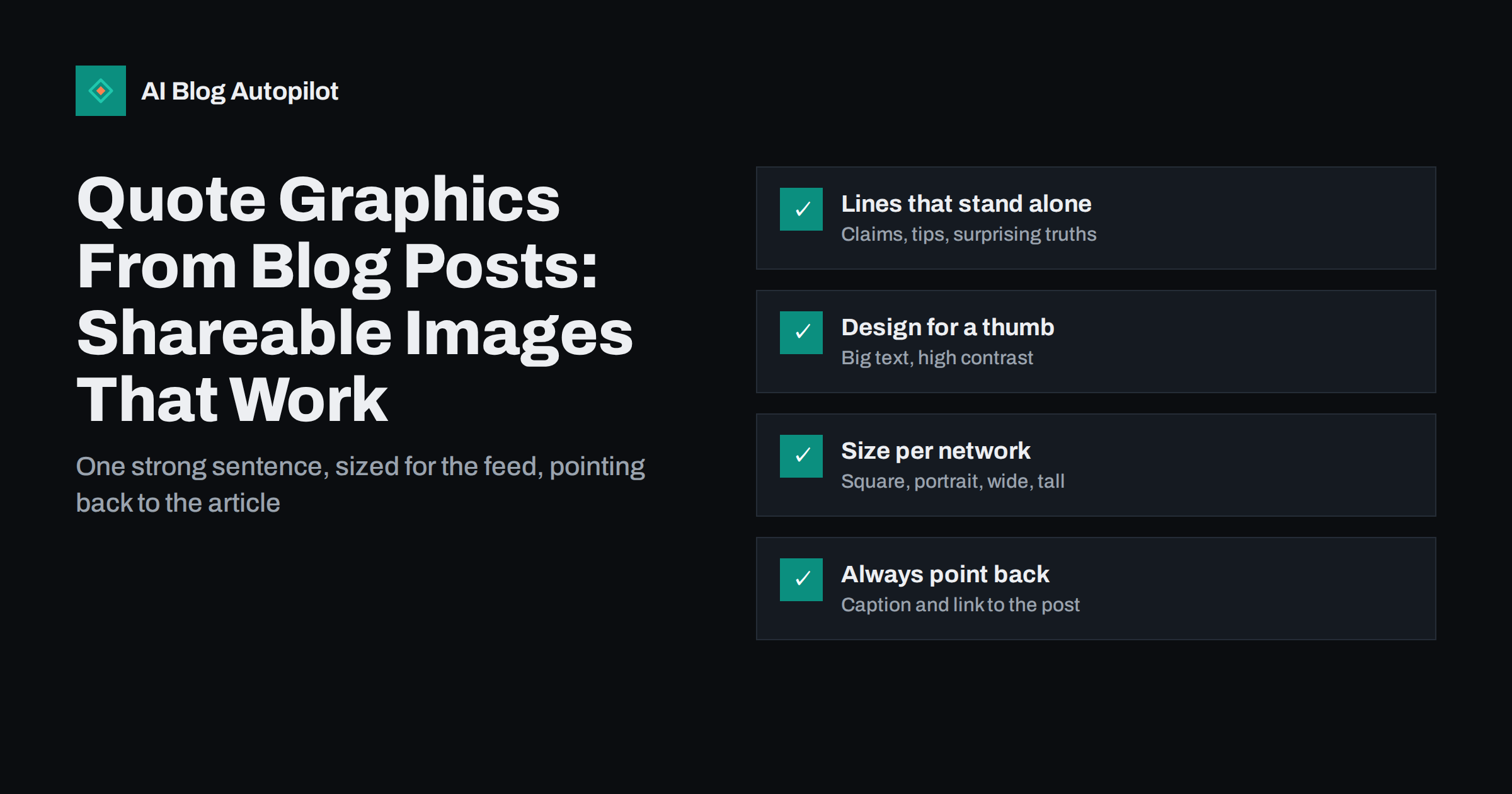
Short answer: a quote graphic is an image that shows one striking line from your article, designed to be read in a second while scrolling. The best ones use a sentence that makes sense on its own, large high-contrast text, your brand colours and the article’s name or address. Size them for each network, write a caption that adds context and links to the post, and include alt text containing the quote. A single article usually yields three to five good quote graphics, which can be shared over several weeks.
Many blog posts are shared to social media once, as a plain link, and then forgotten. The link preview shows the featured image and title, which is fine, but it looks the same as every other link in the feed and gives no reason to stop.
Quote graphics give an article several extra chances to be noticed. Each one shows a different idea from the post, in a format designed for the feed rather than for a search result. This guide covers how to pick the lines, design the images and share them without becoming repetitive.
Why quote graphics work
Social feeds are visual and fast. People decide in a fraction of a second whether to stop. A sharp sentence in large type does something a link preview cannot: it delivers a complete idea before the reader decides to click.
- They deliver value immediately. A useful tip or a clear point of view is worth something even to people who never click.
- They are easy to share. A single line people agree with is more likely to be reposted than a link they have not read.
- They multiply an article. One post can produce several graphics, each testing a different angle.
- They build recognition. Consistent styling makes your posts recognisable in the feed over time.
They do have limits. A quote graphic on its own rarely sends as much traffic as a well-framed link post, because the image is the content. Treat them as a way to build attention and authority, with the link in the caption or comments for readers who want more.
Picking the right lines
The whole graphic depends on the sentence. A weak line in a beautiful design still gets scrolled past.
Good candidates usually fall into a few types:
- A clear, slightly surprising claim. Something that corrects a common belief, stated plainly.
- A practical rule. A tip short enough to remember and act on.
- A crisp definition. A one-sentence explanation of a term people often misunderstand.
- A contrast. “X is not the problem. Y is.” Contrasts are easy to read quickly.
- A question the article answers. Posed so that readers want the answer.
Whatever the type, check three things. The line must make sense without the paragraph around it. It must be true without the caveats that followed it in the article, or you must include the caveat. And it should usually be under about twenty-five words, because longer text becomes hard to read at feed size.
Often the best line is not in the article exactly as written. Tighten it for the graphic, as long as the meaning stays the same. If you are quoting someone else, such as an expert you interviewed, use their exact words and name them, and make sure they are happy to be quoted in this form.
Designing for a thumb-sized screen
Most people will see your graphic on a phone, in a feed, among dozens of other posts. Design for that.
- Large text. The quote should be readable without zooming on a small phone. If it is not, the text is too long or too small.
- High contrast. Dark text on a light colour or light text on a dark colour. Busy photo backgrounds usually make text hard to read unless darkened heavily.
- One or two fonts. A clear typeface for the quote and, at most, one more for the attribution.
- Generous margins. Some apps crop edges or overlay buttons. Keep text away from the edges.
- Consistent branding. The same colours, logo position and layout across all your quote graphics build recognition.
- A small source line. The article title, your site name or a short address at the bottom tells people where the idea came from.
Create a template once and reuse it. Design tools make this simple, and a template keeps every graphic consistent while saving time.
Sizing for each network
Networks display images in different shapes, and an image made for one can be awkwardly cropped on another. You do not need a different design for every platform, but a few shapes cover most needs.
| Shape | Typical use | Notes |
|---|---|---|
| Square (1:1) | Most feeds | A safe default that displays well almost everywhere |
| Portrait (4:5) | Photo-first feeds | Takes more vertical space in the feed, so it is more noticeable |
| Tall (2:3 or 9:16) | Pin boards, stories and full-screen formats | Keep text in the central area; top and bottom are often covered |
| Wide (about 1.91:1) | Link previews and wide feeds | Matches the shape many networks use for link cards |
Networks change their recommended sizes from time to time, so check the current guidance in each network’s help centre when you set up your templates. Exporting at a generous resolution helps the image stay sharp on high-density screens.
Captions, links and alt text
The graphic grabs attention; the caption turns attention into something useful.
- Add context. A sentence or two explaining why this matters or what the article covers. Do not just repeat the quote.
- Link to the article. In the caption where links work, or in the place the network allows, such as a profile link or a first comment. Say clearly where to find it.
- Write alt text. Most networks let you add a description to images. Include the full quote and the attribution, so people using screen readers get the same content and the text is available to the platform.
- Use hashtags sparingly on networks where they help discovery, and not at all where they do not.
Alt text is easy to forget and important. A quote graphic without it is completely inaccessible to someone who cannot see the image, because all the content is inside the picture.
How many to make, and when to share them
A typical long article contains three to five lines strong enough for a graphic. Making more than that tends to produce weaker quotes.
Spread them out. A common pattern is to share the article as a link post when it is published, then share one quote graphic a few days later, another the following week, and so on. Each post gives a different angle and a fresh reason to read. Evergreen articles can be revisited months later with new graphics.
Avoid posting several graphics from the same article on the same day, which looks repetitive and competes with itself. Mix quote graphics with other types of content so your feed does not become a wall of text images.
Mistakes that make quote graphics fail
- Too much text. A paragraph in an image is a screenshot, not a quote graphic.
- Generic lines. “Content is king” and similar phrases have been seen thousands of times. Use a line only your article could have produced.
- Quotes out of context. A line that is misleading without the paragraph around it can damage trust when people later read the article.
- Illegible designs. Thin fonts, low contrast and text over busy photos.
- No path back. A graphic with no source line and no link in the caption gives people no way to find the article.
- Using images you do not have rights to. Background photos and fonts need appropriate licences, just as in the article itself.
Building a simple production routine
Quote graphics are most useful when they become a routine rather than an occasional project. A light process keeps the effort small.
- Mark lines while editing. When you review a new article, highlight the three to five sentences that would work on their own. It takes a minute while the article is fresh in your mind.
- Keep a shared list. Store the chosen lines with the article link in a spreadsheet or document, so anyone on the team can make the graphics.
- Batch the design. Produce graphics for several articles in one session using your templates. Batching is much faster than switching into design mode for each post.
- Schedule them. Add the graphics to your social schedule at intervals, alongside the regular link posts.
- Review what worked. Once a month, look at which graphics earned the most saves, shares and clicks, and note what the strongest lines had in common.
How AI Blog Autopilot fits in
AI Blog Autopilot writes SEO articles, publishes them to your WordPress blog and shares every article to your social networks automatically, with its own text and timing for each network. Its long-form articles, built around a clear structure and an FAQ, usually contain several lines that work as quote graphics. You can design those graphics yourself and post them alongside the automated shares, and on plans that include evergreen reshares, older articles keep reappearing in your feeds too. You can see how the social side works on the AI Blog Autopilot home page.
Related reading
- Turning an Article Into Social Posts That Get Read
- Repurposing an Article: One Piece, Several Formats
- Alt Text: How to Write It and Why It Matters
- Image Rights for Blog Posts: Stock, Screenshots and Generated Images
The bottom line
A quote graphic is a single strong sentence from your article, designed to be read in a second. Pick lines that stand alone and stay true without their context, set them in large, high-contrast type on a consistent template, size them for the networks you use, and always add a caption, a path back to the article and alt text with the full quote. Shared over a few weeks, they give each article several more chances to be noticed.
KKK
What makes a good quote for a social media graphic?
A line that makes sense on its own, says something specific and is short enough to read at a glance, usually under about twenty-five words. Clear claims, practical rules, crisp definitions and contrasts tend to work well.
What size should quote graphics be?
A square image is a safe default for most feeds, portrait works well on photo-first networks, and tall formats suit pin boards and stories. Check each network’s current recommendations in its help centre when setting up templates.
Do quote graphics drive traffic to a blog?
Usually less than a well-written link post, because the image delivers the idea directly. They build attention and recognition, and a clear link in the caption or comments gives interested readers a way to the full article.
Should I add alt text to quote graphics?
Yes. All the content is inside the image, so alt text with the full quote and attribution is the only way people using screen readers can access it.
How many quote graphics should I make from one article?
Typically three to five from a long article. Share them over several days or weeks rather than all at once, and mix them with other types of posts.