ENEnglish
 LTLietuviškai
 DEDeutsch
 FRFrançais
 RUРусский
 ESEspañol
 PLPolski
 ITItaliano
 UKУкраїнська
 CSČeština
 PTPortuguês
 JA日本語
JA日本語 LVLatviešu valoda
 ETEesti
 HUMagyar
 IDBahasa Indonesia
 TRTürkçe
 HIहिन्दी
 ELΕλληνικά
 ARالعربية
 THไทย
THไทย VITiếng Việt
 RORomână
 MSBahasa Melayu
 BNবাংলা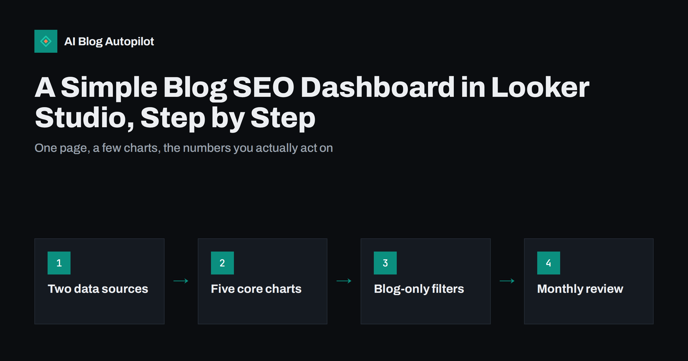
Short answer: a useful blog SEO dashboard in Looker Studio needs only two data sources, Search Console for search performance and Google Analytics for what readers do on the site, and a handful of charts: a clicks and impressions trend, top articles, top queries, articles gaining or losing clicks, and conversions from blog traffic. Filter it to blog URLs, compare periods fairly, and review it monthly with a decision in mind. Looker Studio is free, and its built-in connectors do most of the work.
Search Console and Analytics each answer part of the question “is the blog working?”, but switching between them every month is tedious, and neither shows the whole picture on its own. A simple dashboard puts the numbers that matter on one page, so a monthly review takes minutes instead of an afternoon. This guide explains how to set one up for a blog, which charts are worth including, and the mistakes that make dashboards misleading.
What Looker Studio is and why use it
Looker Studio, formerly called Data Studio, is Google’s free tool for building reports and dashboards from different data sources. For a blog, its main advantages are:
- Built-in connectors for Search Console and Google Analytics, so no exports or spreadsheets are needed.
- Shareable reports that colleagues or clients can view without access to the underlying accounts, if you choose.
- Date comparisons built into most charts, so you can compare with the previous period or the same period last year.
- Filters and controls that let viewers change the date range or focus on one section of the site.
It is not a replacement for the Search Console interface. For detailed investigations, such as why a specific page is not indexed, you still use Search Console directly. The dashboard is for the regular overview.
Connecting the data sources
Create a blank report and add two data sources:
- Search Console. Choose your property, then pick a table. The Search Console connector offers “Site Impression” and “URL Impression”. Site Impression aggregates by site and is best for overall totals and query trends. URL Impression aggregates by page, which you need for page-level charts. Many blog dashboards add both as separate data sources.
- Google Analytics. Choose your GA4 property. This provides sessions, engagement and key events, such as sign-ups or enquiries, by landing page and channel.
You need at least view access to both properties with the same Google account you use in Looker Studio. If your Search Console property is a domain property, make sure you connect the right one; the guide on Search Console property types explains the difference.
The five charts that matter
Resist adding every available metric. A blog dashboard needs to answer a few questions clearly:
- Search trend. A time series of clicks and impressions from Search Console, by week or month, compared with the previous year if you have the data. Weekly grouping smooths out day-of-week patterns.
- Top articles. A table from the URL Impression source with page, clicks, impressions, click-through rate and average position, sorted by clicks.
- Top queries. A table of queries with clicks and impressions, to see what people search for when they find the blog.
- Winners and losers. The top articles table with a period comparison, sorted by change in clicks. This shows which posts need a refresh and which are gaining.
- Outcomes. From Analytics, sessions and key events by landing page, filtered to organic search, so you can see which articles lead to sign-ups or enquiries.
Add scorecards at the top for total clicks, impressions and key events with period comparison, and a date range control. That is enough for most blogs.
If you publish in several languages or countries, a country or language filter control is a useful addition, because a drop in one market can be hidden by growth in another. Keep the layout the same from month to month so that you read the dashboard at a glance rather than searching for each number.
Filtering to the blog
If your site has a shop, product pages or a home page that attracts brand searches, include only blog URLs in the dashboard, or the blog’s performance gets mixed with everything else. Options:
- A URL pattern filter such as “Landing page contains /blog/”, if your posts share a folder.
- A regular expression filter when posts sit at the root, for example excluding known non-blog paths such as
/pricing/,/contact/and the home page. - A brand filter for queries that separates searches containing your brand name from the rest. Non-brand clicks are a better measure of the blog’s reach.
Regular expressions in Looker Studio work much like those in Search Console filters. The recipes in regex filters in Search Console transfer with small changes.
Reading the numbers correctly
Dashboards make numbers look precise. A few facts keep them honest:
- Search Console and Analytics never match. Clicks are counted by Google; sessions are counted by your analytics tag, which may be blocked or not consented to. Compare trends within each source, not totals across them.
- Query totals are lower than site totals. Search Console omits some rare queries for privacy, so the sum of query rows is less than overall clicks.
- Average position is an average. It blends many queries, devices and countries. A page’s average can fall because it started ranking for new, broader queries, which is good news.
- Data arrives with a delay. Search Console data typically lags by a couple of days, so the most recent days look low. Exclude them or use completed weeks.
- Search Console keeps 16 months of data. Year-on-year comparisons only work within that window unless you export and store data yourself.
- Seasonality matters. Compare with the same period last year where possible, not only with the previous month.
The article on why Search Console and Analytics never match explains the differences in detail.
Common dashboard mistakes
- Too many charts. A dashboard with thirty charts is a report nobody reads. If a chart has not led to a decision in three months, remove it.
- Vanity metrics first. Impressions and total sessions look impressive but say little about value. Put clicks from non-brand searches and conversions near the top.
- No comparison. A number without a previous period or target gives no signal.
- Slow reports. Many charts pulling Analytics data can hit connector limits and load slowly or show errors. Keep the number of Analytics charts modest, or extract data for heavy reports.
- Mixing blog and site-wide data without filters, so changes in product or brand traffic hide what the blog is doing.
Sharing the dashboard with a team or client
One of Looker Studio’s strengths is that a report can be shared like a document. A few settings deserve attention before you send the link:
- Data credentials. Each data source uses either the owner’s credentials or the viewer’s. With owner’s credentials, viewers see the data without needing their own access to Search Console or Analytics. That is convenient for clients and managers, but it means anyone with the link sees the data, so share carefully.
- View or edit access. Most people need only view access. Give edit access to one or two people who maintain the report, so charts are not changed by accident.
- Link sharing. Avoid “anyone with the link” for reports containing query data, which can reveal information about customers and plans.
- A short note on the report itself. Add a text box explaining the data sources, the filters applied and the known limitations, such as the delay in Search Console data. It prevents the same questions every month.
For agencies managing several client blogs, build one well-tested report and copy it for each client, replacing the data sources. The layout stays consistent, which makes monthly reviews quicker for everyone.
Turning the dashboard into decisions
A dashboard is useful only if it changes what you do. A monthly review of fifteen to thirty minutes can follow a fixed pattern:
- Check the trend. Is non-brand search traffic up, flat or down compared with last year? If down, is it one section, a few articles or everything?
- Review the losers. Pick two or three articles with the largest drops and decide: refresh, merge, or accept a seasonal dip.
- Review the winners. Look for articles gaining impressions but with a low click-through rate; their titles and descriptions may need work.
- Check outcomes. Which articles lead to enquiries or sign-ups? Plan related topics and stronger internal links to them.
- Write down the actions and check next month whether they were done and what changed.
How AI Blog Autopilot fits in
AI Blog Autopilot plans, writes and publishes articles and shares them to social networks, and its content map shows what was published and where. Search and conversion data stays in your own Search Console and Analytics accounts, so a dashboard like this one is how you judge which topics are working and adjust the plan. See how Autopilot works.
Related reading
- How to Measure Whether a Blog Is Working
- Google Search Console: The Five Reports That Matter
- Content Decay: Spotting Articles That Are Slowly Fading
The bottom line
A blog SEO dashboard should be small and decision-oriented. Connect Search Console and Analytics in Looker Studio, show the search trend, top articles and queries, winners and losers, and conversions from blog traffic, and filter it to blog URLs. Read the numbers with their limitations in mind and review them monthly with specific actions, and the dashboard will earn the time it took to build.
الأسئلة الشائعة
Is Looker Studio free?
Yes, Looker Studio is free to use with its standard connectors, including Search Console and Google Analytics. A paid Pro version exists for organisations that need extra management features, but a blog dashboard does not need it.
Which Search Console table should I use in Looker Studio?
Use Site Impression for overall totals and query trends, and URL Impression for page-level data such as top articles. Many blog dashboards connect both as separate data sources.
Why do Search Console clicks and Analytics sessions differ in my dashboard?
They are measured differently. Search Console counts clicks from Google Search, while Analytics counts sessions recorded by your tracking tag, which can be blocked or declined. Compare trends within each source rather than totals across them.
How often should I review a blog SEO dashboard?
Monthly is enough for most blogs. Search data fluctuates day to day, and a monthly review with a fixed routine gives enough data to see real changes and decide on actions.
Why is recent data missing or low in the dashboard?
Search Console data usually arrives with a delay of a couple of days, so the most recent days appear incomplete. Use completed weeks or months, or exclude the last few days from comparisons.
Can clients view the dashboard without Search Console access?
Yes, if the data sources use the owner’s credentials. Viewers then see the data through the report without their own access, so share the link only with people who should see it.