ENEnglish
 LTLietuviškai
 DEDeutsch
 FRFrançais
 RUРусский
 ESEspañol
 PLPolski
 ITItaliano
 UKУкраїнська
 CSČeština
 PTPortuguês
 JA日本語
JA日本語 LVLatviešu valoda
 ETEesti
 HUMagyar
 IDBahasa Indonesia
 TRTürkçe
 HIहिन्दी
 ELΕλληνικά
 ARالعربية
 THไทย
THไทย VITiếng Việt
 RORomână
 MSBahasa Melayu
 BNবাংলা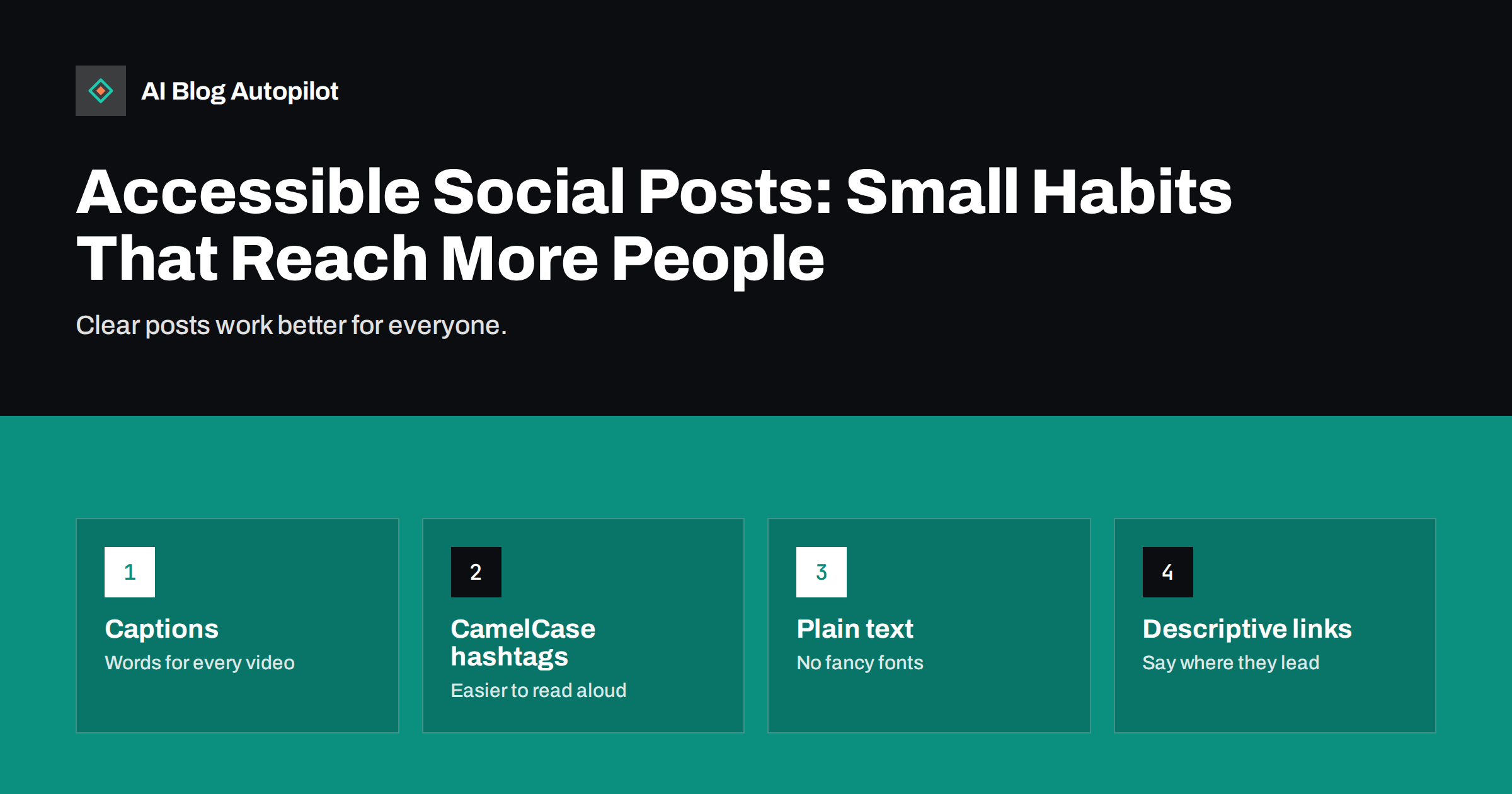
Short answer: an accessible social post is one that people can read, hear, see and understand with different abilities, devices and conditions. The practical habits are few: write plain text, capitalise each word in a hashtag, add captions to video, describe important images, avoid decorative fonts and symbols, use emoji sparingly, make link text clear and keep graphics high in contrast. These steps help people who use screen readers, and they also help anyone who is on a noisy train, in a hurry or reading in a second language.
Accessibility is often discussed for websites, but social posts are content too, and many of the same barriers appear on a small scale. The good news is that most fixes cost nothing and take seconds. This article lists the habits that matter most, explains why each helps and shows how to build them into a routine, especially when posts are scheduled or created in bulk.
Why it matters for a blog’s social posts
Social posts are often the first contact a reader has with your blog. If a post cannot be read by a person using a screen reader, or a video cannot be followed without sound, you lose that reader and may exclude people you would like to serve. Accessible habits widen your audience and signal care.
There is a practical side as well. Plain, well-structured posts are easier to scan, translate and reuse. Captions let people watch with the sound off, which many do. Clear link text tells readers what they will get before they click. In that sense, accessibility and good communication point in the same direction.
The rules and tools differ between networks and change over time. Check the current features on each network you use, such as alt text fields, caption tools and accessibility settings, and use them where they exist.
Write plain, well-ordered text
Screen readers read text in the order it appears and pronounce what they find. Clean text is read well, and clutter is read badly.
- Use short sentences and common words. Define abbreviations the first time you use them.
- Put the main point first. Readers who skim, or who listen to the post, get the key message at once.
- Use line breaks sparingly, for short paragraphs, not to create visual patterns.
- Avoid long strings of symbols, arrows and line decorations. A reader may hear “right arrow right arrow right arrow” instead of a clean message.
- Keep the language inclusive and avoid idioms that translate badly.
Reading the post aloud before you publish is a quick check. If it sounds awkward spoken, it will sound awkward to a screen reader.
Skip decorative fonts
Some tools let you paste text styled as bold, italic or script. These are not real fonts. They are special characters from a different part of the character set, and screen readers may read them letter by letter or skip them. Search engines and translation tools may also fail to recognise them as words. A name in “fancy” characters can be unreadable to someone who relies on speech.
If you need emphasis, use the formatting that the network offers natively, or use capital letters for a single word at most, or rewrite the sentence so that emphasis comes from the wording. Keep text in images to a minimum, and always repeat the key message in the post text.
Capitalise each word in hashtags
A hashtag written in lower case, such as #contentmarketingtips, is hard to read and may be spoken as nonsense. Writing it with capital letters at the start of each word, #ContentMarketingTips, makes the words clear to the eye and lets screen readers pronounce them correctly. This habit is often called CamelCase, and it costs nothing.
- Use a small number of hashtags, and place them at the end of the post, so they do not interrupt the sentence.
- Avoid hashtags made of many words or abbreviations that few people know.
- If a hashtag is part of a sentence, such as “Our #BlogTips this week”, keep the capitals.
Our guide on hashtags covers how many to use and which to choose. The capitalisation rule applies in every case.
Describe images and graphics
Many networks offer a field for alternative text, which is a short description of an image for people who cannot see it. Use it for every image that carries information. Say what the image shows and why it matters, in a sentence or two, without starting with “image of”. For a chart, give the main finding. For a quote graphic, repeat the quote in the post text, since the alt text should not be the only place where it appears.
Where the network has no alt text field, put a short description in the post itself. Decorative images that add nothing can be left without description. Our guide on alt text for social media posts shows where to add it on each network and how to write it well.
Check the design of graphics, too. Use strong contrast between text and background, avoid thin or tiny type, do not rely on colour alone to convey meaning and keep text away from the edges, where apps may crop it.
Caption videos and describe audio
Captions help people who are deaf or hard of hearing, people who are in a place where sound is not possible, and people who watch in a second language. Add accurate captions to every video, whether through the network’s tool or by uploading a caption file, and check them for errors, especially names and technical terms. Automatic captions are a start, but they can be wrong in ways that change the meaning.
- Put the key message in the first seconds, as text and speech.
- Describe important visual action in speech or in the caption text, so that people who cannot see the screen follow the story.
- Avoid flashing or rapid strobing effects, which can be harmful to some people.
- Offer a transcript on your blog for longer videos and link to it.
Use emoji and links thoughtfully
Screen readers speak each emoji by its name. One or two at the end of a line add colour, but a row of ten becomes a spoken list of names that interrupts the message. Do not use emoji in place of words, and avoid putting them in the middle of sentences. Our guide on emoji in brand posts covers how many suit a business account.
For links, say where they lead. Write “Read the full guide to checking redirects” before the link, instead of a bare “Click here”. If a shortened link hides the destination, add a few words that describe it. Place the link at the end of the post, so the text reads smoothly. If the link leads to a file, such as a PDF, or to a video, say so.
A short example shows how the habits combine. Suppose you share a new guide on checking redirects. A careless version uses a styled-font headline, a row of arrows, three lower-case hashtags, a picture of a checklist with no description and a link labelled “here”. An accessible version opens with one plain sentence that states the main tip, adds a two-line summary, ends with the link and a short phrase saying that it leads to the full guide, uses #SiteMigration and #TechnicalSEO, and attaches the checklist image with alt text that gives its three main steps. Both posts take about the same time to write. Only the second can be read by everyone who sees it.
The same applies to your own team. Share the checklist with anyone who writes, schedules or approves posts, and keep a few good examples in a shared document so that the habits become the default, not an extra task.
Build a quick check into your routine
Accessibility habits stick when they are part of the process. Add a short checklist to your posting workflow, and use it for scheduled and automated posts as well as manual ones.
- Is the text plain, with the main point first?
- Are hashtags capitalised and few?
- Does every informative image have alt text or a description?
- Do videos have captions that you have checked?
- Is the link text clear, and is the link at the end?
- Are emoji few and not replacing words?
- Is the graphic contrast strong, and is the key message also in the post text?
Review a sample of posts every month, ideally with a screen reader or with the network’s accessibility features switched on, and invite feedback from readers. If someone tells you about a barrier, thank them and fix it. Treat accessibility as an ongoing improvement, not as a certificate.
It is also worth remembering that accessibility is not only about permanent disability. Temporary conditions, such as a broken arm, and situational ones, such as bright sunlight on a screen or a baby asleep in the next room, affect many people. Posts that work in those moments reach people at the exact time they happen to be reading. That is a strong practical argument for making these habits routine.
How AI Blog Autopilot helps
AI Blog Autopilot asks for your topics, keywords, audience and tone, and writes full SEO articles with FAQ, tags and meta for your WordPress blog. Setting a plain, clear tone for the audience carries through to the text you share, and the checklist above gives you a quick review before posts go out. See the pricing page for plans.
Related reading
- Accessibility for a Blog: The Fixes That Matter Most
- Alt Text on Social Media Posts: Where to Add It and Why
- Hashtags for Blog Posts on Social Media: How Many and Which
- Emojis in Social Posts: How Many Is Too Many for a Brand?
The bottom line
Accessible social posts rely on a handful of simple habits: plain text with the main point first, capitalised hashtags, no decorative fonts, alt text for informative images, checked captions on video, restrained emoji, descriptive links and strong contrast. They cost seconds, they help people with different abilities and conditions, and they make every post clearer. Put the checklist into your routine, review a sample each month and fix barriers as soon as you learn of them.
SSS
Do I need alt text on every social image?
Add it to images that carry information. Purely decorative images can go without, but when in doubt, a short description does no harm.
Why capitalise each word in a hashtag?
It makes the words easier to read and lets screen readers pronounce them correctly. #ContentPlanning is clearer than #contentplanning.
Are automatic captions enough?
They are a good start but often contain errors. Check and correct them, especially names and technical terms.
Is it bad to use fancy text styles in posts?
Often, yes. Styled characters are not true fonts, and screen readers may read them oddly or skip them. Use the network’s own formatting instead.
How can I test a post for accessibility?
Read it aloud, check the image and video features, and try a screen reader or the network’s accessibility settings on a sample of posts.