ENEnglish
 LTLietuviškai
 DEDeutsch
 FRFrançais
 RUРусский
 ESEspañol
 PLPolski
 ITItaliano
 UKУкраїнська
 CSČeština
 PTPortuguês
 JA日本語
JA日本語 LVLatviešu valoda
 ETEesti
 HUMagyar
 IDBahasa Indonesia
 TRTürkçe
 HIहिन्दी
 ELΕλληνικά
 ARالعربية
 THไทย
THไทย VITiếng Việt
 RORomână
 MSBahasa Melayu
 BNবাংলা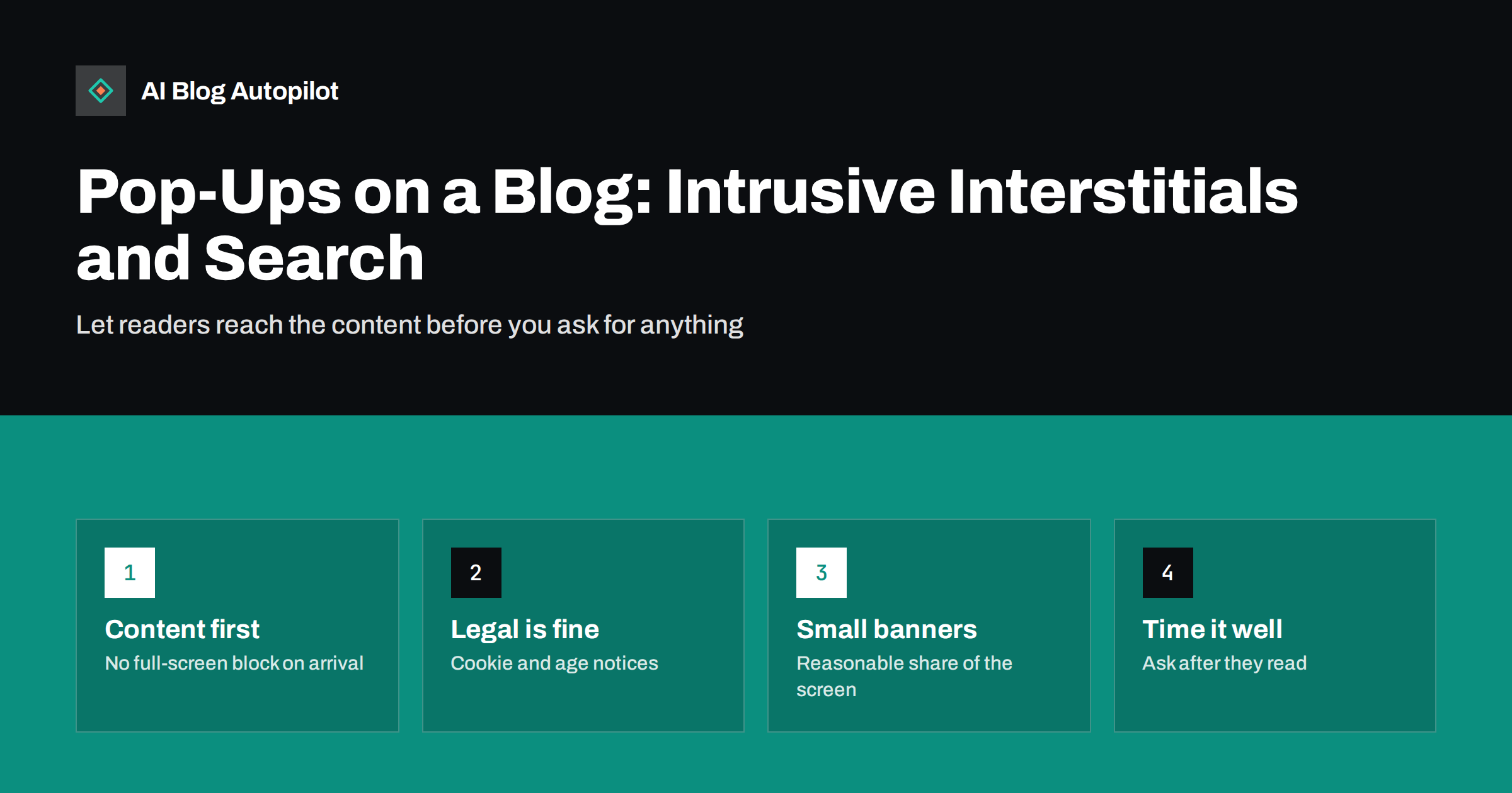
Short answer: pop-ups that cover the main content as soon as a visitor arrives from search, especially on mobile, are what Google calls intrusive interstitials, and they can count against a page’s experience in search. Pop-ups required by law, such as cookie consent or age verification, are acceptable, and so are small banners that use a reasonable amount of screen space. For a blog, the safe approach is to let readers see the content first and ask for sign-ups later, in less intrusive ways.
Almost every blog wants something from its readers: a newsletter subscription, a download, a demo request. Pop-ups are the most direct way to ask, and they can work. They are also one of the most common complaints readers have about blogs, and search engines have made clear that some kinds make a page harder to use. This guide explains which pop-ups cause problems, which are fine and how to collect sign-ups without hurting the reading experience.
What counts as an intrusive interstitial
An interstitial is anything that appears over the page and blocks access to the content, fully or partly. Google’s guidance on interstitials and dialogs describes the problem types in practical terms. They include:
- A pop-up that covers the main content immediately after a visitor lands on the page from search, or while they are reading.
- A standalone interstitial that the visitor must dismiss before reaching the content.
- A layout where the part above the fold looks like an interstitial and the actual content is pushed underneath.
Timing and size are the key variables. The same newsletter box can be acceptable as a small panel after the reader has scrolled most of an article, and intrusive as a full-screen overlay the moment the page opens. The problem is not pop-ups in general. It is making someone who clicked a search result for an answer deal with an obstacle before they can see that answer.
Pop-ups that are acceptable
Some overlays are expected or required, and search engines treat them differently:
- Legal notices. Cookie consent banners and similar notices required by law, when designed reasonably.
- Age verification for content that is legally restricted.
- Login dialogs for content that is genuinely private or behind a subscription.
- Banners that use a reasonable amount of screen space and are easy to dismiss, such as a slim bar at the top or bottom of the screen.
The common thread is that these overlays either protect the reader or are required before the content can legally or technically be shown. A newsletter offer does neither. Even acceptable notices can be done badly. A cookie banner that covers half of a phone screen and hides the “reject” option frustrates readers, whatever its legal status. Keep them compact and clear.
How pop-ups affect search
Pop-ups can affect a blog’s search performance in a few distinct ways:
- Page experience. Google says its ranking systems aim to reward pages with a good page experience, and avoiding intrusive interstitials is one part of that. Relevant, helpful content still matters most, so an intrusive pop-up is rarely the only reason a page does not rank, but it is a needless disadvantage.
- Layout shift. Banners that load late and push the content down add to Cumulative Layout Shift, one of the Core Web Vitals. Overlays that do not move content avoid this, but they still block it.
- Reader behaviour. Visitors who meet a pop-up before the first sentence often leave. That is lost readers and lost trust, whether or not any ranking system notices.
- Crawling and rendering. If content is only available after closing an overlay that requires interaction, search engines may not see it properly. Make sure the content is present in the page even while the overlay is shown.
Mobile is where it matters most
On a desktop screen, a centred box leaves some of the page visible around it. On a phone, the same box usually covers everything. Many pop-up tools apply the same design to both, which is why a pop-up that looks acceptable on the office monitor can be a wall on a phone.
Search engines index the mobile version of pages, and many blog visits come from phones. So test every pop-up on a real phone, not only in a desktop browser’s mobile preview. Check how much of the screen it covers, how large the close button is, and whether the page behind it can be scrolled. The guide on reading a blog on a phone covers other mobile problems worth fixing at the same time.
Better ways to ask for sign-ups
You can still collect subscribers without blocking content. These patterns tend to work well on blogs:
- Inline forms. A sign-up box after the introduction or in the middle of a long article, styled as part of the content.
- End-of-article offers. Readers who reach the end are the most interested. Offer the newsletter or a related template there.
- Content upgrades. A specific extra that matches the article, such as a checklist version of the steps, converts better than a generic newsletter prompt.
- Slim sticky bars. A small bar at the top or bottom of the screen that can be closed with one tap.
- Exit-intent on desktop. A prompt that appears when the pointer moves towards closing the tab. It does not interrupt reading, although it should still be easy to dismiss and shown sparingly.
Our guide to calls to action that fit the article goes deeper into matching the offer to the content.
If you keep a pop-up, set it up carefully
Some businesses see enough sign-ups from pop-ups to keep them. If you do, reduce the harm:
- Delay it. Trigger it after a meaningful amount of scrolling or time on the page, not on arrival.
- Do not show it to search visitors on first view, if your tool allows targeting by referrer or page count.
- Keep it small on mobile. A bottom sheet covering a modest part of the screen is far less disruptive than a full-screen overlay.
- Make closing obvious. A visible close button with a large tap area, and closing by tapping outside the box.
- Respect the answer. Once someone closes it or subscribes, do not show it again for a long period.
- Avoid guilt-trip wording. “No thanks, I don’t like saving money” as the dismiss link annoys readers and reflects badly on the brand.
Auditing the pop-ups already on your blog
Many blogs have more overlays than their owners realise, because each was added by a different plugin at a different time. A quick audit takes about fifteen minutes:
- Open a private browser window on your phone and search for one of your articles. Click through from the results, as a new visitor would.
- Note everything that appears in the first thirty seconds: cookie banner, newsletter box, chat widget, notification permission request, promotional bar, app install prompt.
- Measure the space. How much of the screen is still showing your article? If the answer is “almost none”, readers see the same.
- Repeat on desktop and on a second article, because some tools trigger differently by page type.
- List which plugin or service controls each overlay, and decide for each one whether to keep, delay, shrink or remove it.
Browser notification requests deserve special attention. A prompt asking a first-time visitor to allow notifications before they have read a word is rarely accepted and often irritates. Chat widgets that open automatically can have the same effect; a closed chat button in the corner is usually enough.
Measuring the trade-off
A pop-up’s sign-up count is easy to see; its cost is not. To judge it fairly, compare a period with the pop-up against a period without it, or run it on half of your pages, and look at:
- Sign-ups from all sources combined, not only from the pop-up.
- The share of visitors who read beyond the first screen.
- Pages viewed per visit and returning visitors.
- Search impressions and clicks for the affected pages over several weeks.
Often, inline and end-of-article forms collect a large part of the same sign-ups with much less annoyance. If they do, the pop-up is not worth its cost.
Look at the quality of subscribers too. People who sign up only to make a box disappear tend to open fewer emails and unsubscribe sooner than people who chose to subscribe after reading. A smaller list of engaged readers is usually worth more to a business than a larger list of people who never wanted to be on it. Your email tool’s open and unsubscribe rates by sign-up source will show whether this applies to your blog.
How AI Blog Autopilot fits in
AI Blog Autopilot writes and publishes the articles themselves, with clear structure and an FAQ, and it does not add pop-ups or overlays to your site. Sign-up forms and banners remain part of your WordPress theme and plugins, so the choices in this guide stay with you. Articles that answer the question well give readers a reason to subscribe without being pushed. See how Autopilot works.
Related reading
- Page Speed on a Content Site: What Actually Helps
- Templates, Checklists and Other Reasons to Subscribe
- Building a Newsletter From Your Blog Posts
The bottom line
Let readers reach the content first. Legal notices and small, dismissible banners are fine; full-screen pop-ups on arrival, especially on phones, are the kind search engines call intrusive and readers dislike. Inline forms, end-of-article offers and specific content upgrades usually collect sign-ups with far less damage.
FAQ
Do pop-ups hurt SEO?
Intrusive ones can. Pop-ups that cover the main content right after a visitor arrives, especially on mobile, count against page experience in Google Search. Small banners and legally required notices are treated differently.
Is a cookie consent banner an intrusive interstitial?
Notices required by law, such as cookie consent, are considered acceptable. Keep the banner compact and easy to use, because a banner that hides most of the screen still frustrates readers.
Are exit-intent pop-ups acceptable?
Exit-intent prompts appear when a desktop visitor is about to leave, so they do not block reading in the same way. They should still be easy to close and shown sparingly to the same visitor.
What is the best alternative to a newsletter pop-up?
Inline forms placed after the introduction or at the end of the article, and content upgrades that match the specific post. They reach interested readers without blocking anyone.
How long should I delay a pop-up?
Long enough that the visitor has clearly started reading, for example after scrolling a good part of the article. Showing it immediately on arrival is the pattern most likely to cause problems.
Does a pop-up affect Core Web Vitals?
It can. Banners that load late and push content down add to layout shift, and heavy pop-up scripts can slow the page. Overlays that sit on top without moving content avoid the shift, but still block reading.