ENEnglish
 LTLietuviškai
 DEDeutsch
 FRFrançais
 RUРусский
 ESEspañol
 PLPolski
 ITItaliano
 UKУкраїнська
 CSČeština
 PTPortuguês
 JA日本語
JA日本語 LVLatviešu valoda
 ETEesti
 HUMagyar
 IDBahasa Indonesia
 TRTürkçe
 HIहिन्दी
 ELΕλληνικά
 ARالعربية
 THไทย
THไทย VITiếng Việt
 RORomână
 MSBahasa Melayu
 BNবাংলা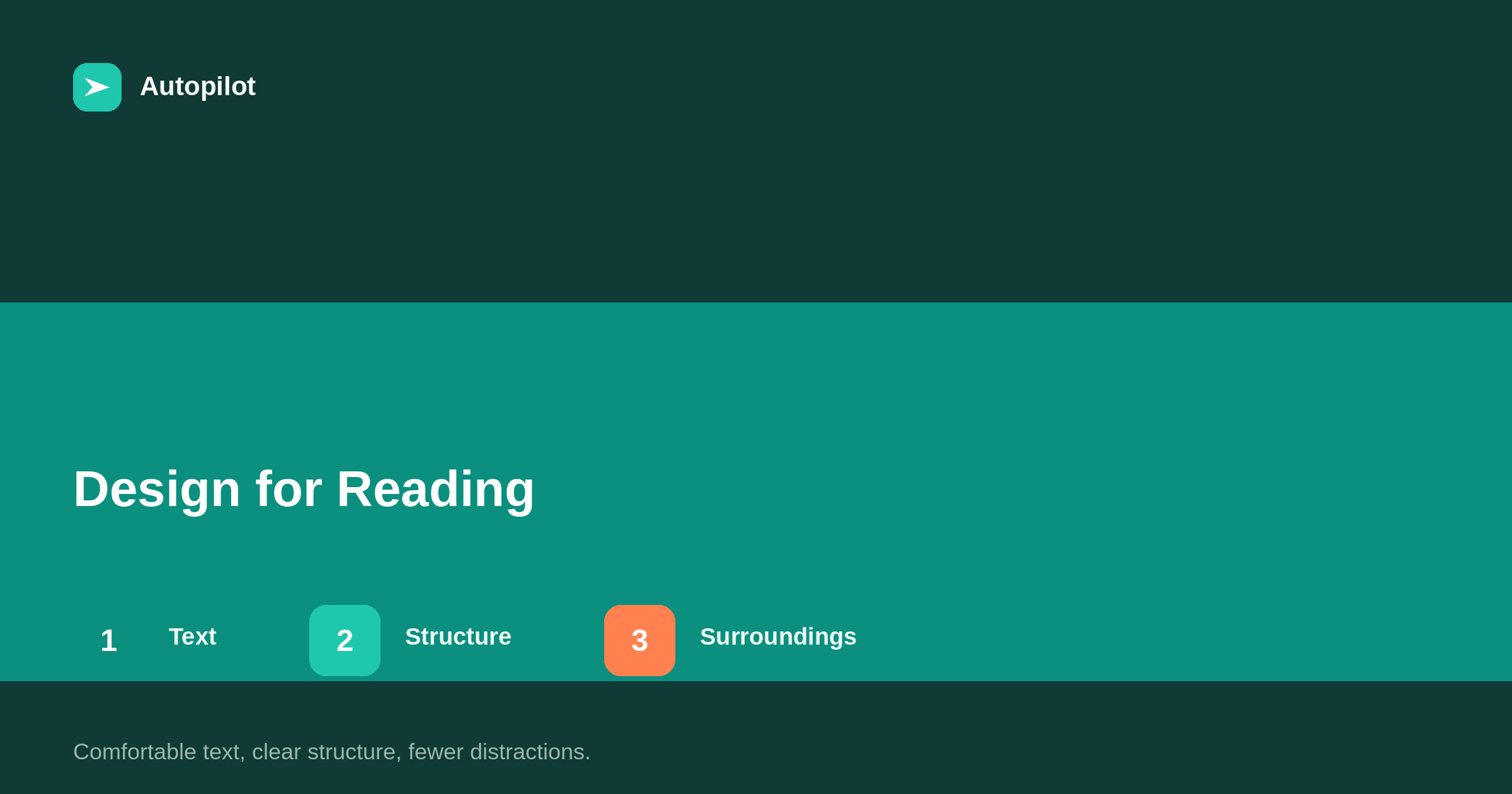
Short answer: design for reading means comfortable body text (around 16 to 20 pixels on most screens), lines of roughly 60 to 80 characters on desktop, generous line spacing, strong contrast, clearly distinguished headings, and enough space between paragraphs. Keep the area around the article calm: few sidebars, no pop-ups on arrival, no animations competing with the text. Make links obvious and images sized to the text column. Test on a phone first, since most readers are there.
A blog’s design is often chosen for how the homepage looks. Readers spend most of their time on article pages, where the only thing that matters is whether the text is comfortable to read.
A few design choices make a large difference, and most of them are settings in the theme.
Text size
Body text should be comfortable without zooming. Around 16 to 20 pixels on most screens is a common range, larger than many older themes use. Readers with less than perfect eyesight, reading on phones or at a distance, benefit most.
Line length
Lines that are too long make it hard to find the start of the next line; lines that are too short break the rhythm of reading. On desktop, roughly 60 to 80 characters per line is comfortable.
Full-width text on a wide screen is one of the most common design problems on blogs. A narrower text column, even on a wide page, fixes it.
Spacing
Line spacing of around 1.5 times the text size, and clear space between paragraphs, makes text easier to scan and less tiring. Dense text blocks discourage reading even when the writing is good.
Contrast
Dark text on a light background, or light on dark, with strong contrast. Light grey text on white looks elegant in a mock-up and is hard to read in practice — accessibility covers contrast requirements.
Headings you can see
Headings should be clearly distinguished from body text by size and weight, with more space above than below, so they group with the text they introduce. Skimming readers navigate by headings; if headings look like body text, the structure is invisible — how to structure an article.
Links
Links should be obvious: underlined, or in a clearly different colour with sufficient contrast. Readers should not have to hover to discover what is clickable.
What surrounds the article
Everything around the article competes for attention.
| Element | Guidance |
|---|---|
| Sidebars | Few or none on articles; move related links below |
| Pop-ups | None on arrival |
| Sticky headers | Small, especially on phones |
| Animations and auto-play | Avoid near the text |
| Adverts | Clearly separated from content, if used |
A calm page keeps attention on the article.
Images and tables
Images should fit the text column and support the text rather than interrupt it. Tables should fit the screen or scroll within their own container — when a table beats three paragraphs.
Typefaces
Choose typefaces designed for reading on screens, in a regular weight for body text. Decorative or very thin fonts may look distinctive in headings but tire readers in paragraphs. Two typefaces — one for headings, one for body — or even one, are usually enough.
Web fonts add loading time. Load only the weights you use, or consider system fonts, which appear instantly and read well — page speed on a content site covers the performance side.
Dark mode
Many readers use dark mode on their devices. If your theme supports it, check that text, links, tables and images remain readable and that contrast holds. Images with transparent backgrounds and dark text can disappear on dark backgrounds.
If the theme does not support dark mode, a well-designed light theme is perfectly acceptable; what matters is that the chosen mode is readable.
Consistency across articles
Use the same styles for the same elements across the blog: one style of table, one style of callout box, one way of presenting FAQs. Consistency helps readers recognise elements instantly, and it makes articles produced by different people or tools look like parts of one publication.
Testing with readers
Ask a few people to read an article on their own phones while you watch, without guidance. Where they zoom, pause, scroll back or give up shows what the design makes difficult. Ten minutes of this is often more informative than any design review.
Changing an existing theme
Most improvements — text size, line length, spacing, heading styles, link colour — are changes to the theme’s settings or stylesheet, applied once to every article. They rarely require a new theme. Test changes on a staging copy first, since they affect every page at once.
Tables, code and wide content
Wide elements break reading on phones. Keep tables to a few columns or let them scroll within their own box, wrap long lines of code, and avoid images wider than the text column. Test the longest table and the widest image on every template.
These problems are often invisible on desktop and obvious on a phone, which is why testing on a phone should come first.
The article footer
After the last paragraph, readers look for what to do next. A short author note, a few related articles, and one clear next step serve them better than a long list of tags, share buttons and widgets. Keep the end of the article as calm as the rest.
Print and reader modes
Some readers print articles or use browser reader modes. Clean HTML with proper headings, lists and tables makes both work well. It is another reason to use real structure rather than visual styling alone.
Measuring the effect
After design changes, compare time on page, scroll depth and pages per visit for articles over a few weeks. Improvements in these suggest the changes made reading easier. They are not guarantees of anything else, but they are good signs that readers are staying with the text.
Change one thing at a time where possible, so you can tell which change helped.
Phone first
Most readers are on phones. Check text size, spacing, headings, tables and images on a phone before anything else — reading on a phone.
Good design for reading does not guarantee rankings; it makes sure readers who arrive can read comfortably, which everything else depends on.
Related reading
If this was useful, these cover the questions that usually come next.
- Readability — the writing side
- Reading on a phone — design on small screens
- Accessibility — design that works for everyone
The bottom line
Use comfortable body text, a text column of roughly 60 to 80 characters on desktop, generous spacing and strong contrast. Make headings and links obvious, keep sidebars, pop-ups and animations away from the text, fit images and tables to the column, and test everything on a phone first.
FAQ
What font size should a blog use?
Around 16 to 20 pixels for body text on most screens is a common, comfortable range.
How wide should the text column be?
Roughly 60 to 80 characters per line on desktop.
Should blog articles have sidebars?
Few or none. Related links can go below the article instead.
Is light grey text a problem?
Often, yes. Low contrast makes text hard to read, especially on phones and for people with low vision.
How should headings look?
Clearly larger or bolder than body text, with more space above than below.
Does design affect SEO?
Indirectly, through readability, mobile usability and page experience. The main effect is on whether readers stay.