ENEnglish
 LTLietuviškai
 DEDeutsch
 FRFrançais
 RUРусский
 ESEspañol
 PLPolski
 ITItaliano
 UKУкраїнська
 CSČeština
 PTPortuguês
 JA日本語
JA日本語 LVLatviešu valoda
 ETEesti
 HUMagyar
 IDBahasa Indonesia
 TRTürkçe
 HIहिन्दी
 ELΕλληνικά
 ARالعربية
 THไทย
THไทย VITiếng Việt
 RORomână
 MSBahasa Melayu
 BNবাংলা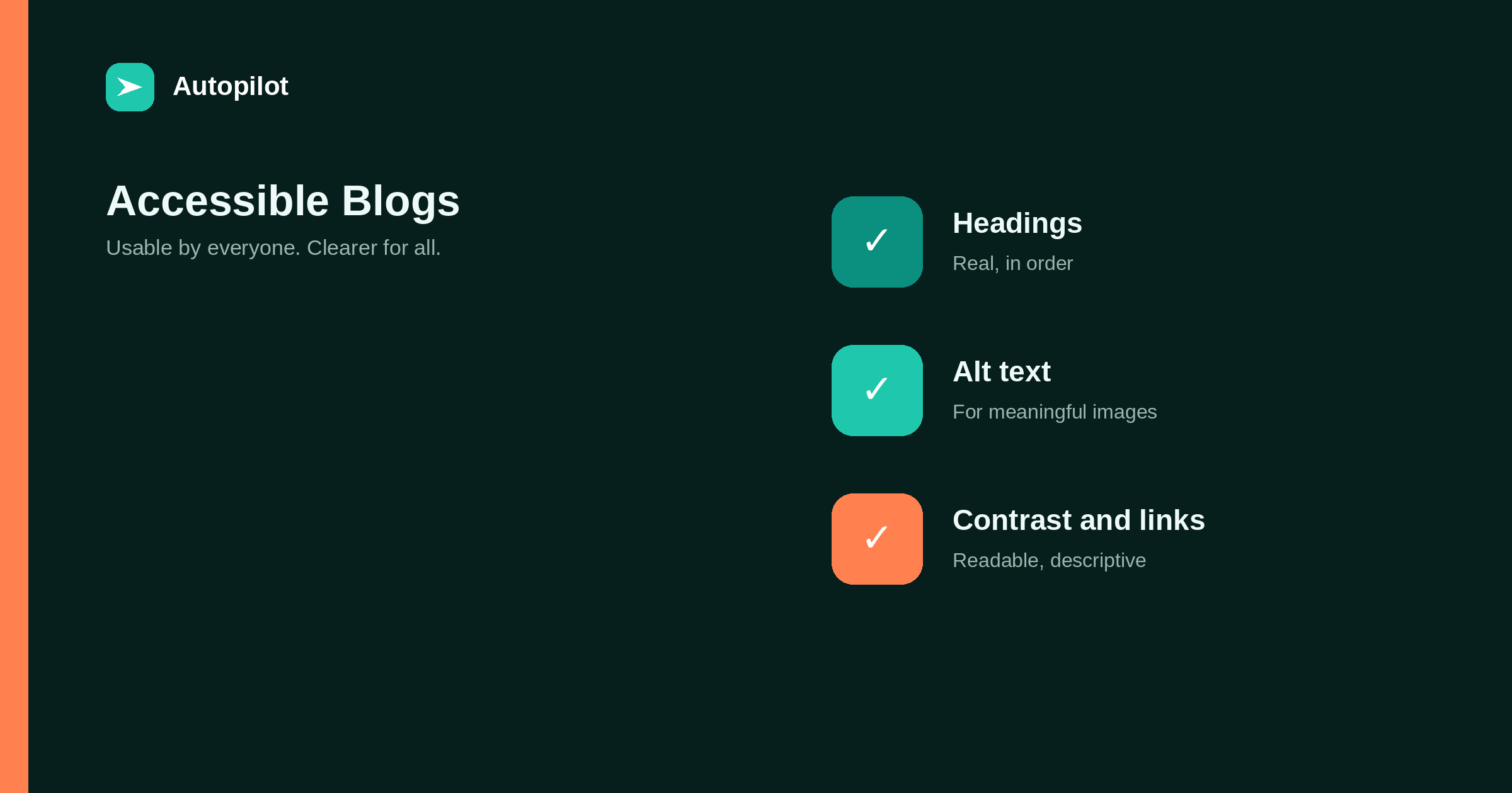
Short answer: the fixes that matter most for a blog are: real headings in a logical order, alt text on meaningful images and empty alt on decorative ones, sufficient colour contrast, descriptive link text, a site that works with a keyboard alone, captions or transcripts for video and audio, and forms with proper labels. Check them with free automated tools and a quick keyboard test. Accessible pages are usually clearer for everyone and easier for search engines to understand, but the main reason is that some readers otherwise cannot use them.
Accessibility means people can use a site regardless of how they access it: with a screen reader, with only a keyboard, with magnification, with limited colour perception. For a blog, most of the work is in a handful of recurring fixes.
Standards such as the Web Content Accessibility Guidelines provide the detail. This article covers the fixes that make the most difference on a typical blog.
Headings in order
Screen reader users often navigate by headings, jumping between them to find the section they want. That only works if headings are real heading elements, used in a logical order.
One H1 for the title, H2 for sections, H3 for subsections. Do not skip levels for visual reasons, and do not use bold paragraphs as headings. how to structure an article covers the same structure from a reader’s point of view.
Alt text
Meaningful images need alt text describing what they communicate; decorative images need an empty alt attribute so screen readers skip them. Images containing text, such as featured images with headlines, need that text in the alt.
writing alt text covers writing it well.
Colour contrast
Text must contrast enough with its background to be readable, including for people with low vision. Light grey text on white is the most common failure.
Guidelines specify minimum contrast ratios, and free contrast checkers test any pair of colours. Check body text, links, buttons and text on images. Do not rely on colour alone to convey meaning, such as marking errors only in red.
Descriptive links
Screen reader users can list all links on a page. A list of click here, read more, here is useless.
Link text should describe the destination: internal linking as you publish rather than click here. That also helps search engines and sighted readers who scan links.
Keyboard access
Some people navigate without a mouse. Every link, button, menu and form should be reachable and usable with the Tab and Enter keys, with a visible focus indicator showing where you are.
Test it yourself: put the mouse aside and try to open the menu, follow a link and submit a form. Menus that open only on hover and pop-ups that trap focus are common problems.
Media and forms
Videos need captions; audio needs transcripts. Forms need visible labels connected to their fields, clear error messages, and no reliance on placeholder text as the only label.
| Element | Minimum |
|---|---|
| Video | Captions, ideally a transcript |
| Audio | Transcript |
| Form fields | Visible labels linked to inputs |
| Errors | Described in text, not only colour |
| Tables | Header cells marked as headers |
when a table beats three paragraphs covers tables with proper headers.
Checking for free
Free automated checkers, including tools built into browsers, catch many issues: missing alt text, low contrast, empty links, heading problems. They cannot catch everything, such as whether alt text is meaningful.
Combine an automated check with a keyboard test and, occasionally, a quick try with a screen reader. Check templates first, since fixing a template fixes every page using it.
Writing accessibly
Accessibility is not only technical. Clear writing helps people with cognitive disabilities, people reading in a second language, and everyone reading on a small screen in a hurry.
Short sentences, plain words, defined terms, one idea per paragraph and a clear structure make articles more accessible without any code changes. Readability covers these in detail.
Avoid instructions that depend on sensory characteristics alone, such as click the green button on the right. Name the button instead.
Motion and zoom
Animations, auto-playing video and moving carousels can distract or cause discomfort. Keep motion minimal, let readers pause anything that moves, and respect the reduced-motion setting some visitors enable.
Make sure text can be enlarged to at least twice its size without content being cut off or overlapping. Test by zooming the browser; a layout that breaks at large zoom levels excludes readers who depend on it.
An accessibility statement
A short accessibility statement says what standard you aim for, what you know still needs work, and how people can report problems. It shows commitment, and the reports it invites are some of the most useful feedback you will receive.
Fixing an existing blog
On an existing blog with hundreds of posts, start with what affects every page: the theme’s colour contrast, heading structure in templates, keyboard access to menus, focus indicators and form labels. One change to a template fixes every page at once.
Then work through content by importance: the most visited articles first, adding missing alt text, fixing heading order and replacing vague link text. Add the checks to your publishing routine so new articles do not add to the backlog. Steady progress matters more than a perfect audit score.
Documents and downloads
Downloadable files such as checklists and guides need attention too. A PDF made from a scanned image is unreadable to screen readers. Create downloads from properly structured documents with real headings and text, or offer the same content as a web page.
Language attribute
Set the page’s language correctly in the HTML so screen readers pronounce text properly. For multilingual sites, each version should declare its own language; a German page marked as English is read with English pronunciation.
Accessibility and search
Many accessibility practices overlap with what helps search engines: clear headings, descriptive links, alt text, readable structure. Accessible sites are often easier to understand for both.
That overlap is a bonus, not the reason. The reason is that some readers otherwise cannot use the page. Accessibility does not guarantee rankings; it makes the content available to everyone.
Related reading
If this was useful, these cover the questions that usually come next.
- Writing alt text — the most common fix
- Readability — clear writing helps everyone
- Reading on a phone — overlapping improvements
The bottom line
Use real headings in order, alt text on meaningful images, sufficient contrast, descriptive link text, full keyboard access, captions and transcripts, and labelled forms. Fix templates first, check with free tools plus a keyboard test, and improve steadily rather than waiting for perfection.
DUK
What are the most important accessibility fixes for a blog?
Headings in order, alt text, colour contrast, descriptive links, keyboard access, captions and transcripts, and labelled forms.
Does accessibility help SEO?
Many practices overlap, such as clear headings and descriptive links, but the main reason is making content usable for everyone.
How do I check my blog’s accessibility?
Use a free automated checker, test navigation with a keyboard only, and occasionally try a screen reader.
What contrast is enough?
Accessibility guidelines specify minimum contrast ratios; free contrast checkers tell you whether a colour pair meets them.
Should every image have alt text?
Meaningful images need descriptive alt text; decorative images need an empty alt attribute.
Where should I start?
With templates and theme settings, since fixing them improves every page at once.