ENEnglish
 LTLietuviškai
 DEDeutsch
 FRFrançais
 RUРусский
 ESEspañol
 PLPolski
 ITItaliano
 UKУкраїнська
 CSČeština
 PTPortuguês
 JA日本語
JA日本語 LVLatviešu valoda
 ETEesti
 HUMagyar
 IDBahasa Indonesia
 TRTürkçe
 HIहिन्दी
 ELΕλληνικά
 ARالعربية
 THไทย
THไทย VITiếng Việt
 RORomână
 MSBahasa Melayu
 BNবাংলা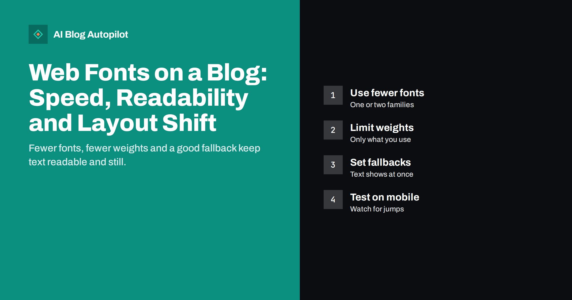
Short answer: web fonts affect a blog’s speed and stability because the browser has to download them before it can show text in the intended style. To keep them cheap, use one or two font families, load only the weights and character sets you actually use, serve the files in a modern compressed format, preload the one or two that matter most, and choose a fallback font that looks similar so the text does not jump when the real font arrives. Readability matters more than decoration.
Fonts are one of those parts of a blog that look small but quietly add weight. A theme may load several families, each in four or five weights, from an external service, and then ask the browser to wait. The result can be blank or shifting text for a moment on a slow connection. This guide explains what happens, which choices have the greatest effect and how to check your own blog without a developer.
What a web font costs
A web font is a file the browser downloads in addition to the page. Each family comes in separate files for each weight and style, so a theme that uses regular, italic, bold and bold italic of two families may request eight files. Each file takes time, uses data and competes with images and scripts.
The browser also has to decide what to show while the file arrives. There are two common behaviours:
- Invisible text for a short period, then the real font appears. Readers see blank spaces where words should be.
- Fallback text first, then a swap to the real font when it loads. Readers see text at once, but the letters can change shape and the layout may shift.
Neither is ideal, but the second is usually better for a blog, because the content is readable immediately. The aim is to make the swap barely noticeable.
Choose fewer families and weights
The simplest improvement is to use less. Most blogs need one family for headings and one for body text, and some work well with a single family for both. Each additional family adds files and visual noise.
Then look at weights and styles:
- Regular and bold cover most needs. A thin, light and extra-bold weight for rare uses may not be worth downloading.
- Italic is often needed for emphasis and quotes, but you may not need a bold italic.
- Variable fonts pack many weights into one file, which can reduce requests when you use several weights, though the single file may be larger.
Check which weights your theme really uses. If a weight appears nowhere on your pages, stop loading it.
Load only the characters you need
Fonts are often split by character sets, such as Latin, extended Latin or Cyrillic. If your blog is in English, you may not need characters for other writing systems. Font services usually let you request only the sets you need. If you publish in several languages, load each set only on the pages that use it where your setup allows, or accept the larger files as the cost of proper display.
Also check that special characters you rely on, such as accented letters, currency symbols or quotation marks, are included. A missing character makes the browser use another font for that one letter, which looks wrong and can change line spacing.
Host fonts well
Where a font file comes from affects how quickly it arrives. There are two common options.
Fonts from an external service
Convenient, but the browser must connect to another domain, which adds a step. It can also raise privacy questions in some regions, because the visitor’s browser contacts a third party. Check your privacy policy and local rules if you use this option.
Fonts from your own server
Hosting the files yourself avoids the extra connection and keeps the request on your domain, where caching and compression are under your control. It needs a little setup and care with licences, but many blog owners find it simpler to manage in the long run.
Whichever you choose, use modern compressed formats, which most browsers support, and make sure the files are cached for a long time so returning visitors do not download them again.
Preload the fonts that matter
Preloading tells the browser to start downloading a file early instead of waiting until it discovers the need in the stylesheet. It helps for the font used by the main heading and the first paragraph, because those are visible straight away.
Use it sparingly. Preloading too many files competes with other important resources and can slow the page down instead. One or two fonts is usually the limit. If you are unsure, test with and without it and see whether the result improves.
Set a fallback that looks similar
While the web font loads, the browser shows a fallback. If the fallback is much wider or narrower than the web font, the text reflows when the swap happens. Lines break in different places and the content below moves, which counts as layout shift and annoys readers who have started to read.
Reduce the jump by:
- Choosing a similar system font as the first fallback, in a similar width and weight.
- Adjusting size and spacing of the fallback where your theme or a developer can do so, so the two fonts occupy about the same room.
- Using a swap setting that shows fallback text immediately instead of leaving gaps.
The best fallback is sometimes the font you would use without a web font at all. Plenty of readable blogs use the system fonts of the reader’s device and load nothing, which is the fastest option.
Icon fonts and other extras
Some themes also load an icon font for social icons, arrows and buttons. These files can be larger than the text fonts, even though a page may use only a handful of icons. If that applies to your theme, consider replacing the icon font with inline images in a vector format for the few icons you use, or ask the theme author whether a lighter option exists. The same applies to fonts loaded by plugins for forms, sliders or widgets that you no longer use. Switching off what you do not need is often the quickest gain.
Readability comes first
Speed is a reason to be careful, but fonts exist to make text easy to read. A few guidelines keep that in focus:
- Use a body size that is comfortable on a phone without zooming.
- Keep line height generous, so lines do not feel crowded.
- Avoid decorative fonts for long text. Save them for a logo or a short heading, if at all.
- Check contrast between text and background, and test the page in bright light on a phone.
A plain font that loads quickly and reads well usually serves readers better than a distinctive one that arrives late.
How to check your own blog
You do not need special tools to start:
- Open the page on a throttled or slow connection using your browser’s developer tools, and watch whether text appears at once.
- Look at the network list for font files, and count how many there are and how large.
- Run a speed test and read the notes on fonts and layout shift.
- Check Search Console’s Core Web Vitals report if your blog has enough traffic, and see whether shifts are flagged.
Change one thing at a time and test again, so you know what helped.
A practical order of work
If your blog loads many fonts and you are not sure where to start, work in this order. First remove families and weights that nothing on your pages uses. Second, request only the character sets you need. Third, move to compressed modern files, hosted where caching works well. Fourth, preload the one or two fonts used above the fold. Fifth, tune the fallback to match. Each step is small, and the first two usually deliver most of the gain, so you can stop as soon as the page feels settled. Write down what you changed and the result of each test, so that a later theme update does not quietly undo the work.
It also helps to review fonts whenever you change the theme or install a new plugin. Themes often bring their own font choices, and a plugin that adds a design feature may add another family without anyone noticing. A quick look at the list of loaded files after each change keeps the total from creeping up again.
Finally, keep in mind who reads your blog. Many readers use older phones and slow networks, where every extra file is felt. A blog that stays readable with fonts blocked or delayed is a blog that works for everyone, and that is a better target than a perfect match to a design mock-up.
How AI Blog Autopilot helps
AI Blog Autopilot writes and publishes the articles, while the look of your blog, including fonts, stays with your WordPress theme. That separation means you can tidy up font loading without touching your content, and the articles continue to publish on schedule. Autopilot connects to WordPress with one click and also supports a webhook or API. See the pricing page for plans.
Related reading
- Core Web Vitals for Bloggers: LCP, INP and CLS Explained
- Page Speed on a Content Site: What Actually Helps
- Blog Design That Helps People Read
- Accessibility for a Blog: The Fixes That Matter Most
The bottom line
Web fonts are worth keeping light. Use one or two families, load only the weights and character sets you need, host the files well, preload the one or two that appear first and choose a fallback that looks like the real font so text does not jump. Keep readability ahead of decoration, and test on a phone with a slow connection. Small changes here often make a blog feel noticeably steadier.
FAQ
Do web fonts slow down a blog?
They can, because each font file must be downloaded. Using fewer families and weights, hosting files well and setting a good fallback keeps the cost small.
How many fonts should a blog use?
One or two families are enough for most blogs. Load only the weights you really use, usually regular and bold, plus italic if needed.
Should I host fonts on my own server?
It is often simpler and faster, because the request stays on your domain and you control caching. It also avoids contacting a third party. Check the font’s licence before hosting it yourself.
What causes text to jump when a page loads?
A fallback font with different proportions from the web font. When the real font arrives, lines reflow and content moves. A similar fallback reduces the jump.
Is it fine to use system fonts only?
Yes. System fonts load instantly and read well. Many fast, clear blogs use them and load no font files at all.