ENEnglish
 LTLietuviškai
 DEDeutsch
 FRFrançais
 RUРусский
 ESEspañol
 PLPolski
 ITItaliano
 UKУкраїнська
 CSČeština
 PTPortuguês
 JA日本語
JA日本語 LVLatviešu valoda
 ETEesti
 HUMagyar
 IDBahasa Indonesia
 TRTürkçe
 HIहिन्दी
 ELΕλληνικά
 ARالعربية
 THไทย
THไทย VITiếng Việt
 RORomână
 MSBahasa Melayu
 BNবাংলা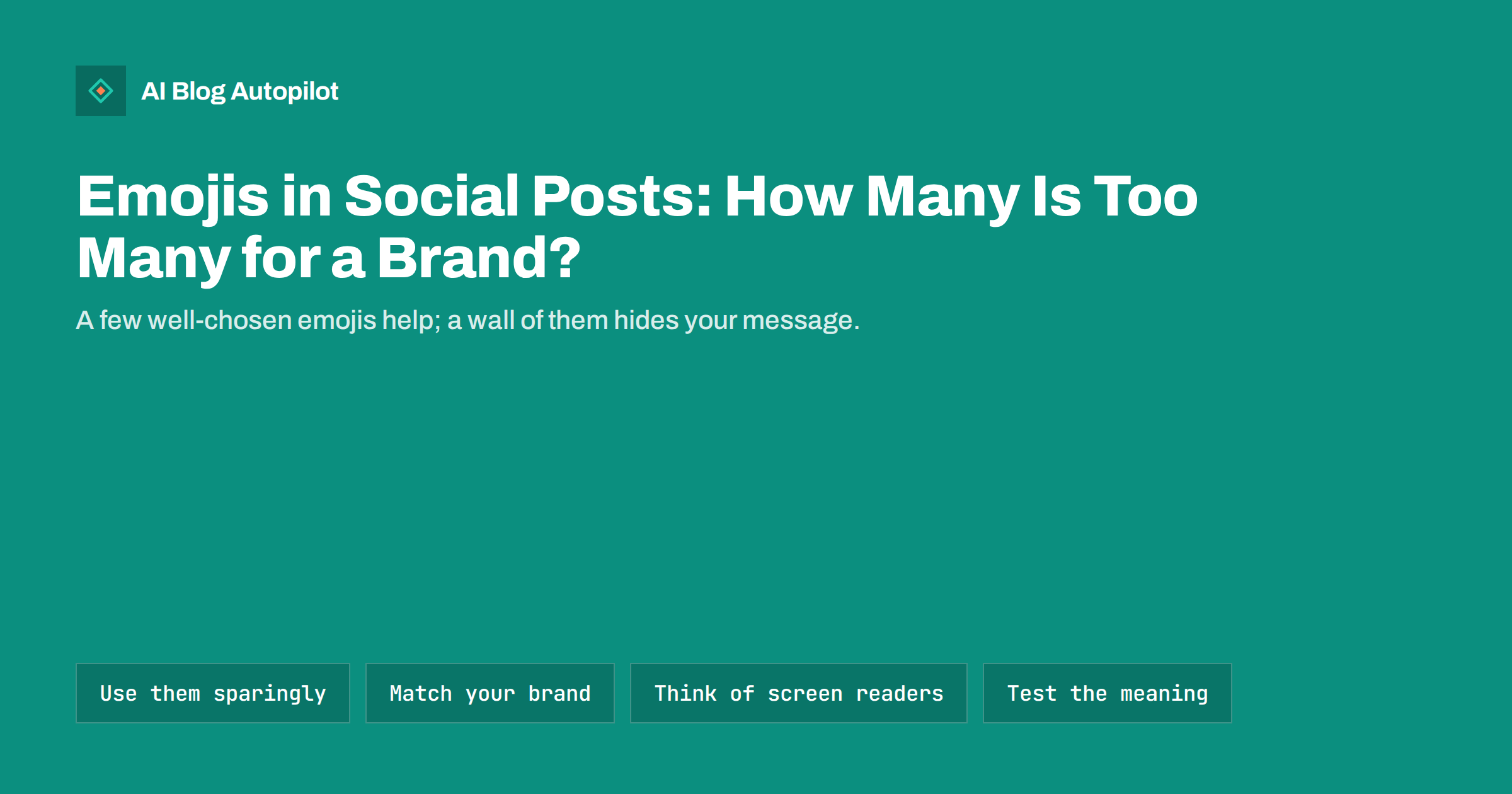
Short answer: a business can use emojis in social posts as long as they support the message instead of replacing it. One to three per post is plenty for most brands, placed where they add clarity, such as marking a list or adding warmth to a greeting. Avoid strings of identical symbols, emojis that stand in for words, and any symbol whose meaning is unclear or varies by culture. Match the level to your brand voice and to the network, and check how the post sounds when read aloud by a screen reader.
Emojis are part of how people write online, and many readers expect a little personality in a social post. At the same time, a post filled with symbols can look careless, be hard to read and be a poor experience for people who use assistive tools. A business blog that shares its articles to social networks has to find a middle path: friendly without being noisy, and consistent enough that readers recognise the brand. This guide gives practical rules you can write into a short style note.
What emojis do well
Used with care, emojis serve several useful purposes in a social post:
- Tone. A single smile or a thumbs-up can soften a short message or signal that you are friendly, which is hard to do in a few words of plain text.
- Structure. A small symbol at the start of each line in a list helps the eye see where items begin, on networks that do not support formatting.
- Attention. A symbol can make a post stand out in a busy feed, although this works only if you do not use it every time.
- Short labels. An arrow pointing to a link, or a tick next to a completed step, can save words.
These benefits fade when overused. If every post has a row of symbols, none of them stands out, and readers learn to skip them.
How many is enough
There is no universal number, but a workable rule is one to three emojis per post, and none in posts where the tone is serious. Think about the subject first. An announcement about a price change, a security problem or a service outage usually needs plain words. A tip, a seasonal greeting or a light question can carry a little more colour.
Some quick checks:
- If you remove the emojis, does the post still say everything it needs to?
- Are you repeating the same symbol several times to add emphasis? One is usually enough.
- Does each one add something, such as tone, structure or a label?
- Would you be comfortable if a customer, a manager or a journalist read the post?
If the answer to the first question is no, the emojis are doing too much work.
Where to place them
Placement affects readability and accessibility. Screen readers read each emoji by its description, so a string of them at the start of a sentence can turn into a long, odd announcement before the actual words. It is usually better to put the main sentence first and add emojis at the end, or to use them one at a time at natural pauses.
Lists and line markers
Using an emoji as a bullet works visually, but each one is read aloud. If you use them, keep to one symbol per line and use the same one throughout the list. Consider plain numbers or dashes for long lists, which are cleaner for everyone.
Links and calls to action
An arrow or a similar symbol can point to a link, but make sure the words around it say what the link is. “Read the guide” is clear with or without an arrow. An arrow on its own is not a call to action.
Accessibility and clarity
People who use screen readers hear every emoji described in words. A row of laughing faces may be announced as the same phrase repeated several times. Keep that in mind when you are tempted to add emphasis.
Other points to bear in mind:
- Do not replace words with symbols. A sentence that depends on a picture of a key or a calendar to make sense will be unclear to some readers and to translation tools.
- Avoid ambiguous symbols. Some emojis have several meanings, and these differ between countries, age groups and communities. If you are unsure what a symbol means, choose something else.
- Check how they appear. Designs vary between devices and networks, so a symbol can look different from what you expected.
- Use alt text for images, not emojis, to describe pictures in a post.
Match your brand voice
A law firm, a children’s shop and a software company will not use emojis in the same way. Decide what suits your brand, and write it down. A short note can cover:
- Whether emojis are used at all, and in which kinds of posts.
- A short approved set of symbols that fit your brand, so posts feel consistent.
- Symbols to avoid, such as those that could look flippant, political or suggestive.
- Differences between networks, for example more relaxed on one network and plain on a professional one.
A short approved list also helps when several people write posts, because it removes guesswork and keeps the account sounding like one voice.
Emojis across networks and languages
Networks differ in how people write. A professional network often rewards a restrained style, while an image or community network tolerates more. Look at how respected accounts in your field write on each network and calibrate, without copying anyone.
If you post in several languages, remember that emoji meaning is not entirely universal. A gesture that is friendly in one country can be rude in another, and some symbols have local associations. Ask a native speaker if you are not sure, or use the symbols that are widely understood, such as a simple tick, arrow or star.
Emojis in titles, hashtags and links
Emojis in the first line of a post can lift attention, but they take space in character-limited networks and may be cut off in previews. Hashtags with emojis do not work reliably, and an emoji inside a link or a hashtag can break it. For blog titles and meta descriptions, plain text is the safer choice, since search results handle symbols inconsistently and may remove them. Keep emojis for the social copy, not the article itself.
Examples of the same message, three ways
Take an ordinary post that shares a new guide. A plain version reads: “New guide: how to set up your content calendar for the quarter. Read it here.” A lightly decorated version adds one symbol at the end, for example a calendar, and perhaps an arrow before the link. An overloaded version starts with three celebration symbols, puts a symbol before every word of the title and ends with a row of arrows. The first two are clear and the third is tiring. Most brands sit comfortably with the first or second, and the choice depends on the network and on how the audience writes.
Seeing the options side by side is the quickest way to agree on a style inside a team. Pick three recent posts, rewrite each in plain, light and heavy styles and ask which feels like your business. The answer is usually obvious, and the examples can sit in the style note as a reference for anyone who writes posts later.
Replies and comments
The same moderation applies when you answer people. A friendly symbol in a reply to a happy customer is natural, but it is out of place in an answer to a complaint, where plain, careful words show that you take the matter seriously. When in doubt, mirror the tone of the person writing to you and leave symbols out of anything sensitive, such as refunds, delays or safety issues.
A quick review before you post
Before publishing, read the post once as if you were a customer who had never heard of you:
- Is the message clear in the first line?
- Do the emojis add something?
- Would the post sound reasonable read aloud?
- Does it match the other posts on the account?
If it passes, post it. If not, remove symbols until it does. Fewer is nearly always safer.
Reviewing the style over time
Revisit your approach every few months. Look at your recent posts and ask whether the symbols still feel right, whether any have started to mean something different and whether the networks you use have changed their habits. A short, regular check keeps the account from drifting into either extreme, and it gives new team members a clear and current reference to follow.
If someone new joins the team, share the style note on their first day and ask them to draft a few posts for review. Feedback on real examples teaches the house style faster than any rule list, and it keeps the voice steady as the team grows or changes.
How AI Blog Autopilot helps
AI Blog Autopilot shares each article to your connected social networks with a text written for each network, with its own length and timing, rather than one message copied everywhere. Its content map shows every post per network, so you can look at what was shared and spot anything that failed. See the pricing page for plans.
Related reading
- Social Media Character Limits: Post Length for Each Network
- Alt Text on Social Media Posts: Where to Add It and Why
- Automated Social Posting Mistakes That Look Robotic
- How to Write Brand Voice Guidelines an AI Can Follow
The bottom line
Emojis can add tone, structure and a little attention to social posts when used sparingly. Keep to one to three per post, put the main message in words, place symbols where they will not clutter a screen reader and avoid ambiguous ones. Write a short note on your brand’s approach so every post sounds like the same business, and leave emojis out of serious announcements, titles and meta descriptions. When in doubt, use fewer.
GYIK
How many emojis should a business use in a social post?
One to three is plenty for most brands, and none for serious announcements. Make sure the post still says everything it needs to without them.
Do emojis affect accessibility?
Yes. Screen readers read each emoji by its description, so long strings become noisy. Put the main message in words and place any emojis at natural pauses or at the end.
Should I use emojis in blog titles or meta descriptions?
Plain text is safer. Search results handle symbols inconsistently and may remove them. Use emojis in the social copy instead.
Can an emoji mean different things in different countries?
Yes. Some symbols have several meanings or local associations. If you post in several languages, choose widely understood symbols or ask a native speaker.
Should every team member use the same emojis?
A short approved list and a few notes keep posts consistent when several people write them, so the account sounds like one voice.