ENEnglish
 LTLietuviškai
 DEDeutsch
 FRFrançais
 RUРусский
 ESEspañol
 PLPolski
 ITItaliano
 UKУкраїнська
 CSČeština
 PTPortuguês
 JA日本語
JA日本語 LVLatviešu valoda
 ETEesti
 HUMagyar
 IDBahasa Indonesia
 TRTürkçe
 HIहिन्दी
 ELΕλληνικά
 ARالعربية
 THไทย
THไทย VITiếng Việt
 RORomână
 MSBahasa Melayu
 BNবাংলা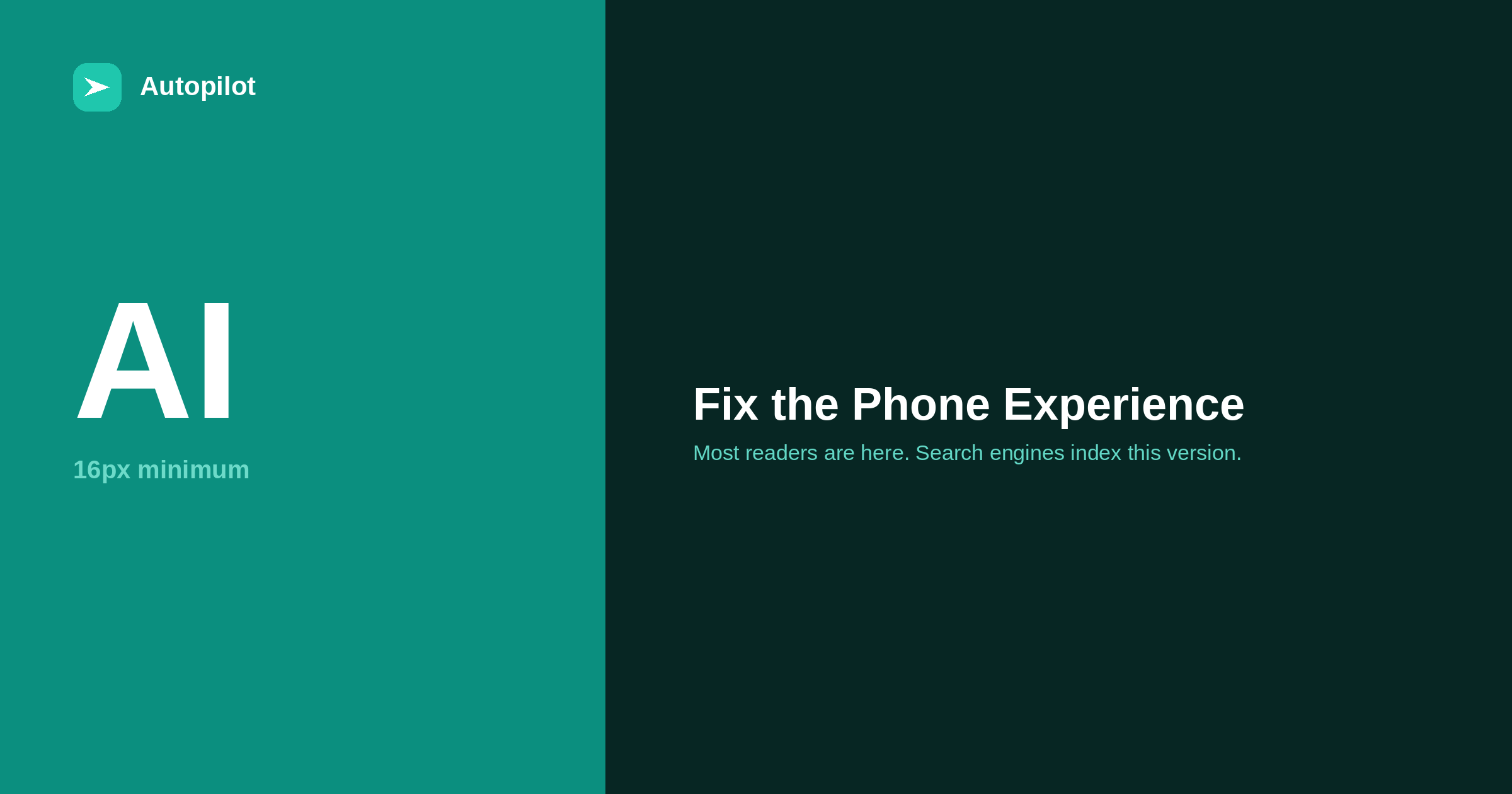
Short answer: check your posts on an actual phone and fix, in this order: body text smaller than about 16 pixels, lines that run edge to edge with no margin, tables wider than the screen, pop-ups that cover the content on arrival, tap targets too small or too close together, headings and images that push the first paragraph below the first screen, and anything that loads late and shifts the layout. Search engines index the mobile version of pages, so what a phone shows is what gets assessed.
Most people who read a blog post read it on a phone, and search engines primarily use the mobile version of a page for indexing. Yet most blogs are written, edited and reviewed on a laptop, where none of the phone problems are visible.
The fix starts with the least technical step possible: open five of your posts on a phone and read them.
Text size and line length
Body text smaller than about 16 pixels is hard to read on a phone without zooming, and zooming means horizontal scrolling on every line.
Line length matters too. Text should have margins on both sides; lines running to the very edge of the screen are tiring to track. Around 16 pixels of padding on each side is a common minimum.
Line spacing of around 1.5 times the text size makes paragraphs noticeably easier to follow. These are theme settings, changed once for every page.
Tables and wide content
A table with five columns fits a laptop and overflows a phone, either breaking the layout or shrinking to unreadable text.
Three options, in order of preference. Keep tables to two to four columns so they fit. Wrap wider ones in a container that scrolls horizontally on its own, without the whole page scrolling. Or split one wide table into two narrower ones — the approach in when a table beats three paragraphs.
The same applies to code blocks, embedded content and any image with small text inside it.
Pop-ups and interstitials
A pop-up that covers the content as soon as a reader arrives from search is one of the few things search guidance explicitly calls out as a poor mobile experience.
It is also simply bad for readers. On a phone a newsletter overlay covers the whole screen, the close button is small and often hard to find, and the reader has not yet seen anything that would make them want to subscribe.
Legally required notices, such as cookie consent, are treated differently. For everything else, put the offer inline after the reader has been helped — which is where it converts better anyway, as traffic against leads discusses.
The first screen
On a phone the first screen is small, and it is where readers decide whether to stay.
Count what appears before the first paragraph: site header, navigation, a large featured image, the title, author and date, share buttons, perhaps a banner. On many blogs the reader must scroll before reading a single sentence of the article.
| Element | On a phone |
|---|---|
| Header and navigation | Compact, one line |
| Featured image | Consider a smaller height or placing it after the intro |
| Title | Visible without scrolling |
| Meta line | One short line |
| Share buttons | At the end, not the top |
| First paragraph | Starting on the first screen |
This is why a strong opening matters so much — the subject of introductions that do not waste time.
Tap targets and navigation
Links and buttons need to be large enough to tap accurately and far enough apart that a thumb does not hit the wrong one. A tap target around 48 pixels square is a widely used guide.
In articles, the usual problems are links packed closely in lists, tiny icon-only buttons, and table-of-contents links with no spacing. In site navigation, it is menus designed for a mouse.
Test by using the page with one thumb. If you mis-tap, readers do too.
Layout shifts and late content
Few things are more irritating on a phone than starting to read and having the text jump down because an image, an advert or a banner loaded above it.
The causes are specific: images without width and height set, embeds that load late, and banners injected after the page appears. Each has a direct fix — reserve the space in advance — and the Core Web Vitals report measures the effect as layout shift. page speed on a content site covers it alongside the other speed factors.
Reviewing on a phone as a habit
Phone problems persist because nobody looks. The simplest fix is to make looking part of the process.
When a new post is published, open it on a phone before sharing it. When the theme or a plugin changes, check three different post types on a phone. And once a quarter, look at the mobile usability and Core Web Vitals information in Search Console for pages flagged as poor.
It takes minutes. It covers the version of your site that most readers see and that search engines use, which makes it strange how rarely it is checked.
Related reading
If this was useful, these cover the questions that usually come next.
- Page speed on a content site — the other half of the phone experience
- When a table beats three paragraphs — keeping tables narrow
- Introductions that do not waste time — why the first screen matters most
The bottom line
Read your posts on an actual phone. Fix text size and margins, keep tables narrow or scrollable, remove pop-ups that cover content on arrival, get the first paragraph onto the first screen, make tap targets big enough, and reserve space for anything that loads late. Then make a phone check part of publishing.
FAQ
Does Google use the mobile version of my site?
Yes. Search engines primarily use the mobile version of a page for indexing and assessment, so what a phone shows is what is evaluated.
What font size should a blog use on mobile?
Around 16 pixels for body text is a sensible minimum, with line spacing of roughly 1.5 and margins on both sides of the text.
Are pop-ups bad for mobile SEO?
Pop-ups that cover the main content as soon as a visitor arrives are identified in search guidance as a poor experience. Legally required notices such as cookie consent are treated differently.
How do I make tables work on a phone?
Keep them to two to four columns, put wider ones in a horizontally scrollable container, or split them into two narrower tables.
How big should links and buttons be on mobile?
Around 48 pixels square is a common guide for tap targets, with enough spacing that adjacent ones are not tapped by mistake.
How do I check my blog’s mobile experience?
Read your posts on a real phone first. Then use Search Console’s Core Web Vitals report and a mobile-friendly test for specific pages.